

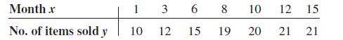
Question: When the points in a scatter plot show a curvilinear trend rather than a linear trend, statisticians have methods of fitting curves rather than straight
When the points in a scatter plot show a curvilinear trend rather than a linear trend, statisticians have methods of fitting curves rather than straight lines to the data, thus obtaining a better fit and a better prediction model. One type of curve that can be used is the logarithmic regression curve. The data shown are the number of items of a new product sold over a period of 15 months at a certain store. Notice that sales rise during the beginning months and then level off later on.
Draw the scatter plot for the data.
2. Find the equation of the regression line.
3. Describe how the line fits the data.
4. Using the log key on your calculator, transform the x values into log x values.
5. Using the log x values instead of the x values, find the equation of a and b for the regression line.
6. Next, plot the curve y = a + b log x on the graph.
7. Compare the line y = a + bx with the curve y = a + b log x and decide which one fits the data better.
8. Compute r, using the x and y values; then compute r, using the log x and y values. Which is higher?
9. In your opinion, which (the line or the logarithmic curve) would be a better predictor for the data? Why?
Month x No. of items sold y 3 6 8 1 10 12 10 12 15 21 21 15 19 20
Step by Step Solution
3.50 Rating (170 Votes )
There are 3 Steps involved in it
To solve this problem well walk through each part 1 Draw the Scatter Plot You will need graph paper or software to plot the points Plot the months on ... View full answer

Get step-by-step solutions from verified subject matter experts