

Question: Construct a pie chart for the data in Table 2-9. Compare the pie chart to the Pareto chart in Exercise 13. Which graph is more
Construct a pie chart for the data in Table 2-9. Compare the pie chart to the Pareto chart in Exercise 13. Which graph is more effective in showing the information in Table 2-9?
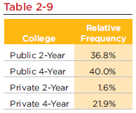
Table 2-9 Relative College Public 2-Year Public 4-Year Frequency 36.8% 40.0% Private 2-Year 1.6% Private 4-Year 21.9%
Step by Step Solution
★★★★★
3.58 Rating (162 Votes )
There are 3 Steps involved in it
1 Expert Approved Answer
Step: 1 Unlock

Using the Excel we construct pie chart and the Pareto chart to the given data as fo... View full answer
Question Has Been Solved by an Expert!
Get step-by-step solutions from verified subject matter experts
Step: 2 Unlock
Step: 3 Unlock
Document Format (2 attachments)
1545_605d88e213242_818113.pdf
180 KBs PDF File
1545_605d88e213242_818113.docx
120 KBs Word File