

Question: Figure 2-6 includes relative frequency polygons for the pulse rates of females and males. When comparing two such data sets, why is it generally better
Figure 2-6 includes relative frequency polygons for the pulse rates of females and males. When comparing two such data sets, why is it generally better to use relative frequency polygons instead of frequency polygons?
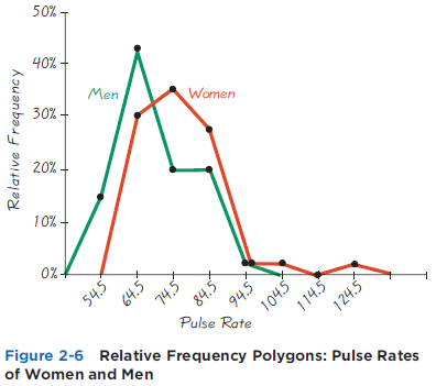
50% - 40% Men 30% Women 20% 10% - 0%- 54.5 124.5 Relative Frequency Polygons: Pulse Rates Pulse Rate 114.5 Figure 2-6 of Women and Men Relative Frequency 64.5 74.5 84.5 94.5 104.5
Step by Step Solution
3.46 Rating (162 Votes )
There are 3 Steps involved in it
The relative frequency polygon of pulse rates of women an... View full answer

Get step-by-step solutions from verified subject matter experts
Document Format (2 attachments)
1545_605d88e21025c_818063.pdf
180 KBs PDF File
1545_605d88e21025c_818063.docx
120 KBs Word File