

The following table presents the percentage of people who lived in poverty in the various regions of
Question:
The following table presents the percentage of people who lived in poverty in the various regions of the United States in the years 2010 and 2014.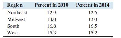
a. Construct a side-by-side bar graph for these data.
b. True or false: The poverty rate was lower in 2014 than in 2010 in each region.
c. Which region had the greatest decrease?
Step by Step Answer:

This question has not been answered yet.
You can Ask your question!
Related Book For 

Question Posted:
