

The graph shows the median income for females from 2010 to 2017 in constant 2017 dollars. (a)
Question:
The graph shows the median income for females from 2010 to 2017 in constant 2017 dollars.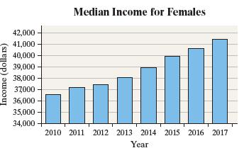
(a) How is the graph misleading? What does the graph seem to convey?
(b) Redraw the graph so that it is not misleading. What does the new graph seem to convey?
Fantastic news! We've Found the answer you've been seeking!
Step by Step Answer:
a The vertical axis starts at 34000 instead of 0 This tends to indicate that the median earni...View the full answer

Answered By
PALASH JHANWAR
I am a Chartered Accountant with AIR 45 in CA - IPCC. I am a Merit Holder ( B.Com ). The following is my educational details.
PLEASE ACCESS MY RESUME FROM THE FOLLOWING LINK: https://drive.google.com/file/d/1hYR1uch-ff6MRC_cDB07K6VqY9kQ3SFL/view?usp=sharing
3+ Reviews
10+ Question Solved
Related Book For 
Question Posted:
