Question: 1. Describe what each graph illustrates with the data 2. Was the graphic selected appropriate for the data? 3. Any alternative graphics work better? 4.

1. Describe what each graph illustrates with the data

2. Was the graphic selected appropriate for the data?

3. Any alternative graphics work better?

4. What changes would you recommend making the story of the data clearer?
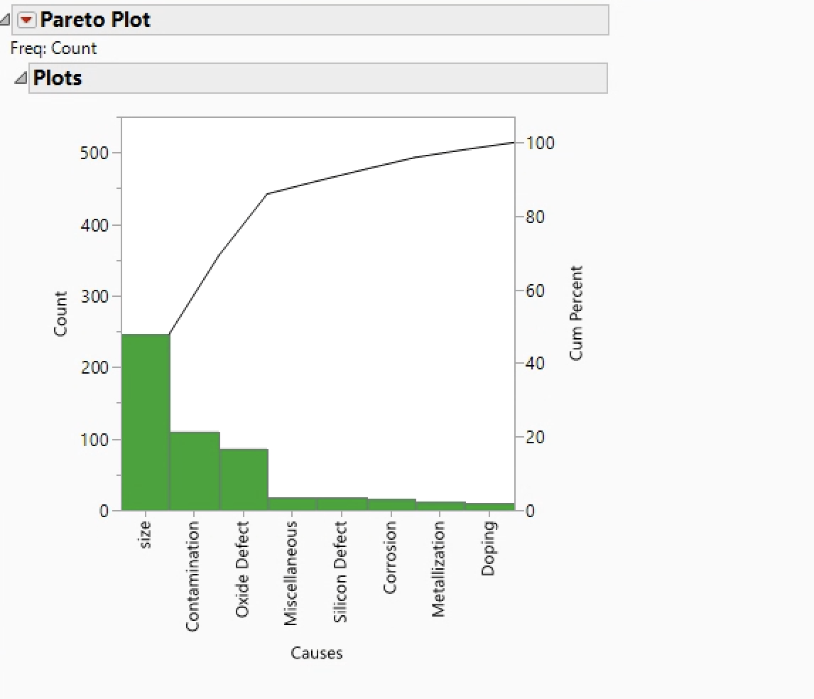
1. Describe what each graph illustrates with the

A Pareto Plot Freq: Count 4 Plots 100 500 400 -80 300 -60 Count Cum Percent 200 -40 100 -20 0 -0 size Contamination Oxide Defect Miscellaneous Silicon Defect Corrosion Metallization Doping Causes A Pareto Plot Freq: Count 4 Plots 100 500 400 -80 300 -60 Count Cum Percent 200 -40 100 -20 0 -0 size Contamination Oxide Defect Miscellaneous Silicon Defect Corrosion Metallization Doping Causes

Step by Step Solution

There are 3 Steps involved in it

1 Expert Approved Answer
Step: 1 Unlock blur-text-image
Question Has Been Solved by an Expert!

Get step-by-step solutions from verified subject matter experts

Step: 2 Unlock
Step: 3 Unlock

Students Have Also Explored These Related General Management Questions!