

Question: 2. Test layouts with an emulator. a. Open index.html in Google Chrome, open the Developer Tools, then turn on Device Mode b. Select the Google
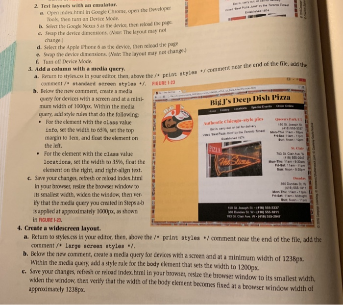
2. Test layouts with an emulator. a. Open index.html in Google Chrome, open the Developer Tools, then turn on Device Mode b. Select the Google Nexus 5 as the device, then reload the page c. Swap the device dimensions. (Note: The layout may not change.) d. Select the Apple iPhone 6 as the device, then reload the page e. Swap the device dimensions. (Note: The layout ma f. Turn off Device Mode. y not change.) 3. Add a column with a media query. a. Return to styles.css in y our editor, then, above the / print styles /comment near the end of the file, add the comment/standard screen styles /.FIGURE 1-23 b. Below the new comment, create a media query for devices with a screen and at a mini- mum width of 1000px. Within the media query, add style rules that do the following: BigJ's Deep Dish Pizza .For the element with the class value Authentie Chieago-style ples e's Park 414) 555-3337 info, set the width to 65%, set the top margin to lem, and float the element on Eat in carry aut or call for delive Pri-Sat 1am-1am un Non-10pm Euabished 074 the left. PIZZ For the element with the class value locations, set the width to 35%, float the 416) 555-2047 Mon-Thuu 11am-930pm element on the right, and right-align text Bun: Noo 9:30pm C. Save your changes, refresh or reload index.html Dusdas 60 Dundas St W 416) 556-1011 Mon-Thu 11am-11pm in your browser, resize the browser window to its smallest width, widen the window, then ver- ify that the media query you created in Steps a-b is applied at approximately 1000px, as shown in FIGURE I-23 4. Create a widescreen layout. a. Return to styles.css in your editor, then, above the / print styles /comment near the end of the file, add the comment /*large sereen styles* Within the media query, add a style rule for the body element that sets the width to 1200px. widen the window, then verify that the width of the body element becomes fixed at a browser window width of approximately 1238px. t, create a media query for devices with a screen and at a minimum width of 1238px. c. Save your changes, refresh or reload index.html in your browser, resize the browser window to its smallest width, 2. Test layouts with an emulator. a. Open index.html in Google Chrome, open the Developer Tools, then turn on Device Mode b. Select the Google Nexus 5 as the device, then reload the page c. Swap the device dimensions. (Note: The layout may not change.) d. Select the Apple iPhone 6 as the device, then reload the page e. Swap the device dimensions. (Note: The layout ma f. Turn off Device Mode. y not change.) 3. Add a column with a media query. a. Return to styles.css in y our editor, then, above the / print styles /comment near the end of the file, add the comment/standard screen styles /.FIGURE 1-23 b. Below the new comment, create a media query for devices with a screen and at a mini- mum width of 1000px. Within the media query, add style rules that do the following: BigJ's Deep Dish Pizza .For the element with the class value Authentie Chieago-style ples e's Park 414) 555-3337 info, set the width to 65%, set the top margin to lem, and float the element on Eat in carry aut or call for delive Pri-Sat 1am-1am un Non-10pm Euabished 074 the left. PIZZ For the element with the class value locations, set the width to 35%, float the 416) 555-2047 Mon-Thuu 11am-930pm element on the right, and right-align text Bun: Noo 9:30pm C. Save your changes, refresh or reload index.html Dusdas 60 Dundas St W 416) 556-1011 Mon-Thu 11am-11pm in your browser, resize the browser window to its smallest width, widen the window, then ver- ify that the media query you created in Steps a-b is applied at approximately 1000px, as shown in FIGURE I-23 4. Create a widescreen layout. a. Return to styles.css in your editor, then, above the / print styles /comment near the end of the file, add the comment /*large sereen styles* Within the media query, add a style rule for the body element that sets the width to 1200px. widen the window, then verify that the width of the body element becomes fixed at a browser window width of approximately 1238px. t, create a media query for devices with a screen and at a minimum width of 1238px. c. Save your changes, refresh or reload index.html in your browser, resize the browser window to its smallest width
Step by Step Solution
There are 3 Steps involved in it

Get step-by-step solutions from verified subject matter experts
 Study Help