

Question: 8. Create a chart that makes it easy to compare the average (2017-2019) car sales by dealership. You may need to Car Sales by Dealership
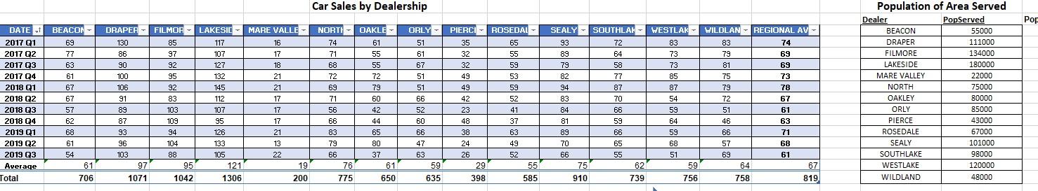
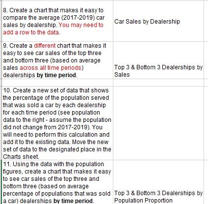
8. Create a chart that makes it easy to compare the average (2017-2019) car sales by dealership. You may need to Car Sales by Dealership add a row to the data. 10. Create a new set of data that shows the percentage of the population served that was sold a car by each dealership for each time period (see population data to the right - assume the population did not change from 2017-2019). You will need to perform this calculation and add it to the existing data. Move the new Charts sheet. 11. Using the data with the population figures, create a chart that makes it easy to see car sales of the top three and bottom three (based on average percentage of populations that was sold Top 3 \& Bottom 3 Dealerships by a car) dealerships by time period. 8. Create a chart that makes it easy to compare the average (2017-2019) car sales by dealership. You may need to Car Sales by Dealership add a row to the data. 10. Create a new set of data that shows the percentage of the population served that was sold a car by each dealership for each time period (see population data to the right - assume the population did not change from 2017-2019). You will need to perform this calculation and add it to the existing data. Move the new Charts sheet. 11. Using the data with the population figures, create a chart that makes it easy to see car sales of the top three and bottom three (based on average percentage of populations that was sold Top 3 \& Bottom 3 Dealerships by a car) dealerships by time period
Step by Step Solution
There are 3 Steps involved in it

Get step-by-step solutions from verified subject matter experts