

Question: Confused on steps 10 and 11 10. Create a new set of data that shows the percentage of the population served that was sold a
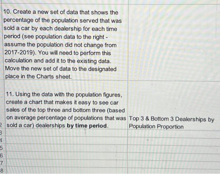
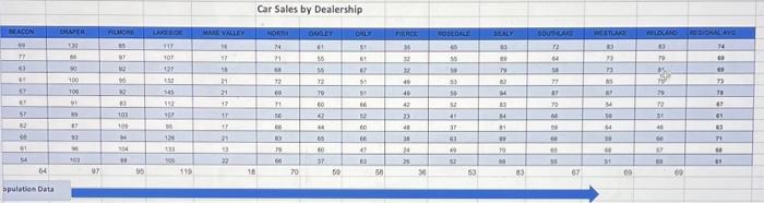
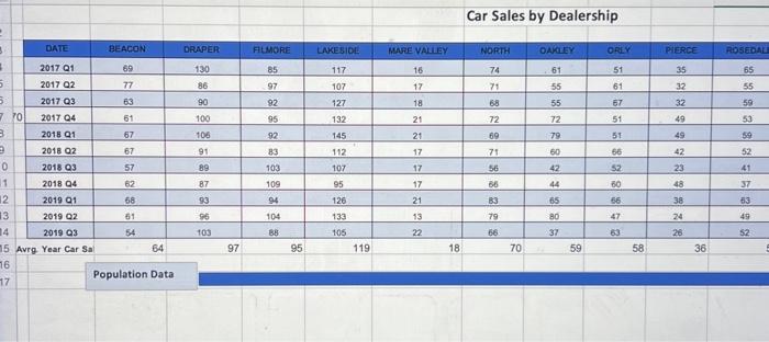
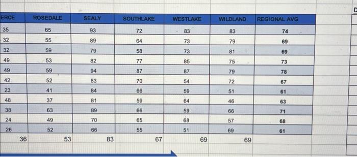
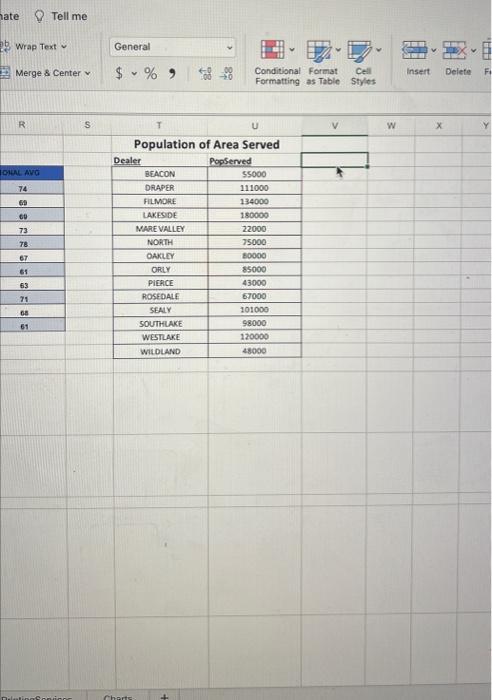
10. Create a new set of data that shows the percentage of the population served that was sold a car by each dealership for each time period (see population data to the right assume the population did not change from 2017-2019). You will need to perform this calculation and add it to the existing data. Move the new set of data to the designated place in the Charts sheet. 11. Using the data with the population figures, create a chart that makes it easy to see car sales of the top three and bottom three (based on average percentage of populations that was Top 3& Bottom 3 Dealerships by sold a car) dealerships by time period. Population Proportion Car Sales by Dealership Population Data \begin{tabular}{|c|c|c|c|c|c|c|} \hline ERCE & ROSEDALE & SEALY & SOUTHLAKE & WESTLAKE & WLDLAND & REGIONAL AVG \\ \hline 35 & 65 & 93 & 72 & . 83 & 83 & 74 \\ \hline 32 & 55 & 89 & 64 & 73 & 79 & 69 \\ \hline 32 & 59 & 79 & 58 & 73 & 81 & 69 \\ \hline 49 & 53 & 82 & 77 & 85 & 75 & 73 \\ \hline 49 & 59 & 94 & 87 & 87 & 79 & 78 \\ \hline 42 & 52 & 83 & 70 & 54 & 72 & 67 \\ \hline 23 & 41 & 84 & 66 & 59 & 51 & 61 \\ \hline 48 & 37 & 81 & 59 & 64 & 46 & 63 \\ \hline 38 & 63 & 89 & 66 & 59 & 66 & 71 \\ \hline 24 & 49 & 70 & 65 & 68 & 57 & 68 \\ \hline 26 & 52 & 66 & 55 & 51 & 69 & 61 \\ \hline 36 & 53 & 83 & 67 & 69 & 69 & \\ \hline \end{tabular} Tell me Wrap Text Merge 8 Center General $%,$00ConditionalFormatCellFormattingasTableStyles Styles 10. Create a new set of data that shows the percentage of the population served that was sold a car by each dealership for each time period (see population data to the right assume the population did not change from 2017-2019). You will need to perform this calculation and add it to the existing data. Move the new set of data to the designated place in the Charts sheet. 11. Using the data with the population figures, create a chart that makes it easy to see car sales of the top three and bottom three (based on average percentage of populations that was Top 3& Bottom 3 Dealerships by sold a car) dealerships by time period. Population Proportion Car Sales by Dealership Population Data \begin{tabular}{|c|c|c|c|c|c|c|} \hline ERCE & ROSEDALE & SEALY & SOUTHLAKE & WESTLAKE & WLDLAND & REGIONAL AVG \\ \hline 35 & 65 & 93 & 72 & . 83 & 83 & 74 \\ \hline 32 & 55 & 89 & 64 & 73 & 79 & 69 \\ \hline 32 & 59 & 79 & 58 & 73 & 81 & 69 \\ \hline 49 & 53 & 82 & 77 & 85 & 75 & 73 \\ \hline 49 & 59 & 94 & 87 & 87 & 79 & 78 \\ \hline 42 & 52 & 83 & 70 & 54 & 72 & 67 \\ \hline 23 & 41 & 84 & 66 & 59 & 51 & 61 \\ \hline 48 & 37 & 81 & 59 & 64 & 46 & 63 \\ \hline 38 & 63 & 89 & 66 & 59 & 66 & 71 \\ \hline 24 & 49 & 70 & 65 & 68 & 57 & 68 \\ \hline 26 & 52 & 66 & 55 & 51 & 69 & 61 \\ \hline 36 & 53 & 83 & 67 & 69 & 69 & \\ \hline \end{tabular} Tell me Wrap Text Merge 8 Center General $%,$00ConditionalFormatCellFormattingasTableStyles Styles
Step by Step Solution
There are 3 Steps involved in it

Get step-by-step solutions from verified subject matter experts