

Question: a. 6. Customize the chart in the range G21:039 as follows: Enter 2021 Park Spending as Percentage of Total as the chart title. b. Apply
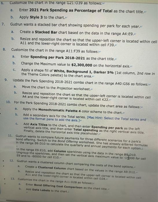

a. 6. Customize the chart in the range G21:039 as follows: Enter 2021 Park Spending as Percentage of Total as the chart title. b. Apply Style 3 to the chart. 7. Gudrun wants a stacked bar chart showing spending per park for each year. a. Create a Stacked Bar chart based on the data in the range A4:E9. b. Resize and reposition the chart so that the upper-left corner is located within cell A11 and the lower-right corner is located within cell F39. 8. Customize the chart in the range A11:F39 as follows: a. Enter Spending per Park 2018-2021 as the chart title. b. Change the Maximum value to $2,300,000 on the horizontal axis. C. Apply a shape fill of White, Background 1, Darker 5% (1st column, 2nd row in the Theme Colors palette) to the chart area. 9. Update the Park Spending 2018-2021 combo chart in the range A40:656 as follows: Move the chart to the Projection worksheet. b. Resize and reposition the chart so that the upper-left corner is located within cell A4 and the lower-right corner is located within cell K22. 10. For the Park Spending 2018-2021 combo chart, update the chart area as follows: Apply the Monochromatic Palette 4 color scheme to the chart. b. Add a secondary axis for the Total series. (Mac Hint: Select the Total series and use the format pane to add the axis.) Add Axis Titles to the chart, and then enter Spending per park as the left vertical axis title, and then enter Total spending as the right vertical axis title. Finally, delete the horizontal axis title placeholder. 11. Gudrun wants to compare future payments for three different scenarios for a park's bond offering. Switch to the Bond Offering worksheet. She has already entered formulas in the range 89:D10 to calculate the quarterly and annual payments for each option.. in the range 19:10, add Column sparklines using the data in the range B9 D10. Ungroup the sparklines, and then set the vertical axis maximum value to -15000 for cell E9 and to -60000 for cell E10. 12. Gudrun wants a clustered column chart comparing the costs of the bond options. Create a Clustered Column chart based on the values in the range A9:010.- Resize and reposition the chart so that the upper left corner is located within cell A11 and the lower right corner is located within cell D28. 13. Customize the chart in the range A11:028 as follows Enter Bond Offering Cost Comparison as the chart title. Add Data Labels to the chart a. b 01 Xfx A B D E F G H 1 K Alanis Parks Department Spending on Parks, 2018-2021 2 Chart Title $ 2016 172,331 S 225, 2005 302.212S 200,098 $ 552.6365 1.452,5575 2010 178,606 $ 241 890 $ 302,805 $ 207,832 $ 589,846 $ 1,500,000 2020 180,624 $ 247033 $ 310 247 $ 221,167 S 575,239 $ 1534,311 S 2021 189,794 252,853 319,880 237,810 588,124 1,586460 $ $ $ 38% 15% 4 Park 6 Carver 6 Fem Foley 7 Oleander 8 Pleistocene 9 Sartoris 10 Total 11 12 13 14 15 10 17 16 10 20 21 21 14% 24 25 26 27 30 31 37 33 34 38 27 38 Documentation Spending Projection Bond Offering + A c D E H L M N Alanis Parks Department Park Spending Projection ON 3 4 5 6 7 8 9 10 11 12 13 14 15 16 17 16 19 20 21 23 24 26 26 22 30 32 35 34 30 36 37 an Documentation Spending Projection Bond Offering + B D E F G 1 Alanis Parks Department Bond Offering Projection Option A $575,000 0.0169 60 Option $575,000 0.0175 60 CORE $575,000 0.0181 60 ($15,314.08) ($61 256.31 2 3 4 5 Total Bond Revenue 6 Quarterly Interest Rate 7 # of payments 8 9 Quarterly Payments 10 Annual Payments 11 12 13 14 15 e 16 17 18 19 20 21 22 ($15,555.68) ($62.222.73) ($15.799.25) ($63,197.00) 24 25 26 27 28 29 30 31 32 33 34
Step by Step Solution
There are 3 Steps involved in it

Get step-by-step solutions from verified subject matter experts