Question: A bar graph will appear with your categories on the x-axis and your frequencies on the y-axis. To cdit the graph ( 2 points total
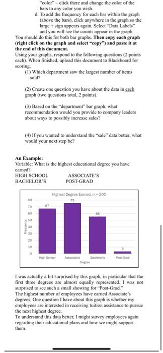
A bar graph will appear with your categories on the x-axis and your frequencies on the y-axis. To cdit the graph ( 2 points total for cach graph, 4 points total): (1) Make sure you add labels to the graph. If you click on the graph, a large + sign appears on the right. Click on your frequencies on the y-axis. To edit the graph (2 points total for each graph, 4 points total)= (1) Make sure you add labels to the graph. If you click on the graph, a large + sign appears on the right. Click on that and check the box for "axis labels". You can then click on each and type in the appropriate label. For the x axis, this is the variable name. For the y-axis, this would be "frequency or "count". (2) To practice enhancing bar graphs, I would like you to do the following: a. Right click on the graph. A long mena should appear, with the word "font" toward the top of the list. Click there and change the font for your graph to Franklin Gothic Book. You do not need to change anything else in the font menu. b. Double click on any of the bars in your graph. A side bar should appear that is labeled "Format Data Series". We are going to make the bars wider. To do that, enter "50" in the box next to "Gap Width". c. In that same "Fomat Data Series "bar, click on the little paint can at the top. Click on "Fill" and select "solid fill". You will see a line appear that says "color" - click there and change the color of the bars to any color you wish. d. To add the frequency for each bar within the graph (above the bars), click anywhere in the graph so the large + sign appears again. Select "Data Labels" and you will see the counts appear in the graph. You should do this for both bar graphs. Then copy each graph (right click on the graph and select "copy") and paste it at the end of this document. Using your graphs, respond to the following questions (2 points cach). When finished, upload this document to Blackboard for scoring. (1) Which department saw the largest number of items sold? (2) Create one question you have about the data in eash graph (two questions total. 2 points). (3) Based on the "department" bar graph, what recommendation would you provide to company leaders about ways to possibly increase sales? (4) If you wanted to understand the "sale" data better, what would your next step be? An Example: Variable: What is the highest educational degree you have carned? HIGH SCHOOL ASSOCLATE'S BACHELOR'S POST-GRAD "color" - click there and change the color of the bars to any color you wish. d. To add the frequency for each bar within the graph (above the bars), click anywhere in the graph so the large + sign appears again. Select "Data Labels" and you will see the counts appear in the graph. You should do this for both bar graphs. Then copy each graph (right click on the graph and select "copy") and paste it at the end of this document. Using your graphs, respond to the following questions (2 points each). When finished, upload this document to Blackboard for scoring. (1) Which department saw the largest number of items sold? (2) Create one question you have about the data in each graph (two questions total, 2 points). (3) Based on the "department" bar graph, what recommendation would you provide to company leaders about ways to possibly increase sales? (4) If you wanted to understand the "sale" data better, what would your next step be? An Example: Varable: What is the highest educational degree you have carned? HIGH SCHOOL ASSOCIATE'S BACHELOR'S POST-GRAD I was actually a bit surprised by this graph, in particular that the first three degrees are almost equally represented. 1 was not surprised to see such a small showing for "Post-Grad." The highest number of employees have earned Associate's degrees. One question I have about this graph is whether my employees are interested in receiving tuition assistance to pursue the next highest degree. To understand this data better, I might survey employees again regarding their educational plans and how we might support them. A bar graph will appear with your categories on the x-axis and your frequencies on the y-axis. To cdit the graph ( 2 points total for cach graph, 4 points total): (1) Make sure you add labels to the graph. If you click on the graph, a large + sign appears on the right. Click on your frequencies on the y-axis. To edit the graph (2 points total for each graph, 4 points total)= (1) Make sure you add labels to the graph. If you click on the graph, a large + sign appears on the right. Click on that and check the box for "axis labels". You can then click on each and type in the appropriate label. For the x axis, this is the variable name. For the y-axis, this would be "frequency or "count". (2) To practice enhancing bar graphs, I would like you to do the following: a. Right click on the graph. A long mena should appear, with the word "font" toward the top of the list. Click there and change the font for your graph to Franklin Gothic Book. You do not need to change anything else in the font menu. b. Double click on any of the bars in your graph. A side bar should appear that is labeled "Format Data Series". We are going to make the bars wider. To do that, enter "50" in the box next to "Gap Width". c. In that same "Fomat Data Series "bar, click on the little paint can at the top. Click on "Fill" and select "solid fill". You will see a line appear that says "color" - click there and change the color of the bars to any color you wish. d. To add the frequency for each bar within the graph (above the bars), click anywhere in the graph so the large + sign appears again. Select "Data Labels" and you will see the counts appear in the graph. You should do this for both bar graphs. Then copy each graph (right click on the graph and select "copy") and paste it at the end of this document. Using your graphs, respond to the following questions (2 points cach). When finished, upload this document to Blackboard for scoring. (1) Which department saw the largest number of items sold? (2) Create one question you have about the data in eash graph (two questions total. 2 points). (3) Based on the "department" bar graph, what recommendation would you provide to company leaders about ways to possibly increase sales? (4) If you wanted to understand the "sale" data better, what would your next step be? An Example: Variable: What is the highest educational degree you have carned? HIGH SCHOOL ASSOCLATE'S BACHELOR'S POST-GRAD "color" - click there and change the color of the bars to any color you wish. d. To add the frequency for each bar within the graph (above the bars), click anywhere in the graph so the large + sign appears again. Select "Data Labels" and you will see the counts appear in the graph. You should do this for both bar graphs. Then copy each graph (right click on the graph and select "copy") and paste it at the end of this document. Using your graphs, respond to the following questions (2 points each). When finished, upload this document to Blackboard for scoring. (1) Which department saw the largest number of items sold? (2) Create one question you have about the data in each graph (two questions total, 2 points). (3) Based on the "department" bar graph, what recommendation would you provide to company leaders about ways to possibly increase sales? (4) If you wanted to understand the "sale" data better, what would your next step be? An Example: Varable: What is the highest educational degree you have carned? HIGH SCHOOL ASSOCIATE'S BACHELOR'S POST-GRAD I was actually a bit surprised by this graph, in particular that the first three degrees are almost equally represented. 1 was not surprised to see such a small showing for "Post-Grad." The highest number of employees have earned Associate's degrees. One question I have about this graph is whether my employees are interested in receiving tuition assistance to pursue the next highest degree. To understand this data better, I might survey employees again regarding their educational plans and how we might support them