

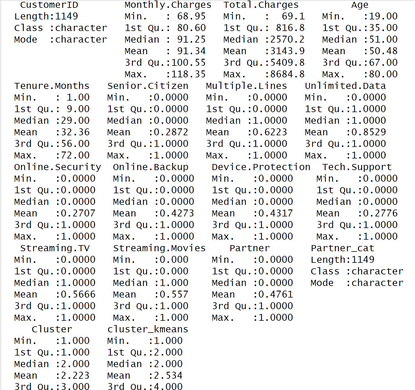
Question: Analyze the table in the attached image and use it to answer the following: q ) ( 1 . 5 ) Once you have chosen
Analyze the table in the attached image and use it to answer the following: q Once you have chosen which results to focus on explain, in details, how the individual clusters contained in your chosen solution differ from each other, in terms of attributes.
r Finally, use such analysis to propose at least interesting plans bundles your company could offer. Try to be specific in your answer. For example, let us assume among your attributes you have Age and Minutes of Calls. You find a cluster that distinguish itself for a very high average Age and high average Minutes of Calls, while the others clusters have similar averages for age and Minutes of Calls. This may indicate that there is a segment of customers that tend to include more senior individuals and that use intensively phone calls, compared to other services. As such, the company could think of introducing a Plan for Seniors, that targets people above a certain age and that only includes unlimited phonecalls while any other service would need to be paid by consumption, for example
Step by Step Solution
There are 3 Steps involved in it
1 Expert Approved Answer
Step: 1 Unlock

Question Has Been Solved by an Expert!
Get step-by-step solutions from verified subject matter experts
Step: 2 Unlock
Step: 3 Unlock