

Question: Can someone help me with Matplotlib? I need to write a code that will make my output look like the second one. I am working
Can someone help me with Matplotlib? I need to write a code that will make my output look like the second one. I am working on google colab
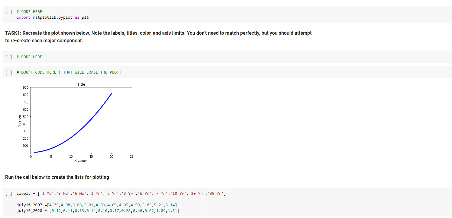
[] # CODE HERE import matplotlib.pyplot as plt TASK1: Recreate the plot shown below. Note the labels, titles, color, and axis limits. You don't need to match perfectly, but you should attempt to re-create each major component. [] # CODE HERE [ ] # DON'T CODE HERE ! THAT WILL ERASE THE PLOT! Title 900 800 700 600 500 Y values u 400 300 200 100 0 0 10 15 20 25 X values Run the cell below to create the lists for plotting [] labels = ['1 Mo', '3 Mo', '6 Mo','1 Yr','2 Yr','3 Yr','5 Yr','7 Yr','10 Yr','20 Yr', '30 Yr'] july16_2807 = [4.75,4.98,5.08,5.01,4.89,4.89,4.95,4.99,5.85,5.21,5.14] july16_2020 = [0.12,0.11,0.13,0.14,0.16,0.17,0.28,0.46,0.62,1.09,1.31]
Step by Step Solution
There are 3 Steps involved in it

Get step-by-step solutions from verified subject matter experts