

Question: Can someone help me with MatplotLib? I need to write a code that will make my output look like the second one. I am working
Can someone help me with MatplotLib? I need to write a code that will make my output look like the second one. I am working on google colab
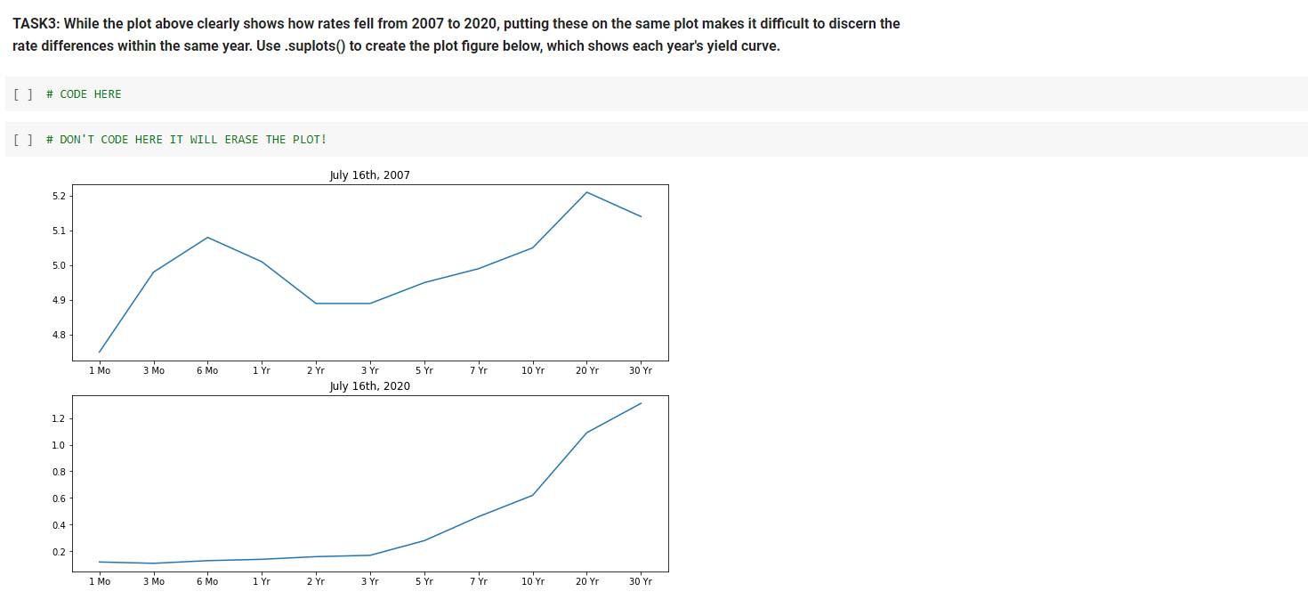
TASK3: While the plot above clearly shows how rates fell from 2007 to 2020, putting these on the same plot makes it difficult to discern the rate differences within the same year. Use .suplots() to create the plot figure below, which shows each year's yield curve. [] # CODE HERE [] # DON'T CODE HERE IT WILL ERASE THE PLOT! July 16th, 2007 5.2 5.1 5.0 4.9 4.8 1 Mo 3 Mo 6 Mo 1 Yr 5 Yr 7 Yr 10 Yr 20 Yr 30 Y Zr 3 Yr July 16th, 2020 12 10 0.8 0.6 0.4 0.2 1 MO 3 6 Mo 1 Yr 2 Yr 3 Yr 5 Yr 7 Yr 10 Yr 20 Yr 30 Yr TASK3: While the plot above clearly shows how rates fell from 2007 to 2020, putting these on the same plot makes it difficult to discern the rate differences within the same year. Use .suplots() to create the plot figure below, which shows each year's yield curve. [] # CODE HERE [] # DON'T CODE HERE IT WILL ERASE THE PLOT! July 16th, 2007 5.2 5.1 5.0 4.9 4.8 1 Mo 3 Mo 6 Mo 1 Yr 5 Yr 7 Yr 10 Yr 20 Yr 30 Y Zr 3 Yr July 16th, 2020 12 10 0.8 0.6 0.4 0.2 1 MO 3 6 Mo 1 Yr 2 Yr 3 Yr 5 Yr 7 Yr 10 Yr 20 Yr 30 Yr
Step by Step Solution
There are 3 Steps involved in it

Get step-by-step solutions from verified subject matter experts