

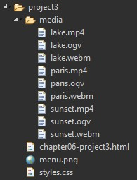
Question: chapter06-project3.html Chapter 6 Share Your Travels HTML5 Video Source: https://videos.pexels.com/videos/arc-de-triomphe-in-paris-470 Source: https://videos.pexels.com/videos/timelapse-video-at-a-lake-435 Source: https://videos.pexels.com/videos/sunset-at-a-lake-464 styles.css @import url(https://fonts.googleapis.com/css?family=Open+Sans); @import url(https://fonts.googleapis.com/css?family=Lobster); p, h1, h2, h3, ul, li,
chapter06-project3.html
<!DOCTYPE html>
<html lang="en">
<head>
<meta charset="utf-8">
<title>Chapter 6</title>
<link rel="stylesheet" href="styles.css" />
</head>
<body>
<header>
<h2>Share Your Travels</h2>
<nav><img src="menu.png" alt="mobile menu icon"></nav>
</header>
<main>
<section>
<h1>HTML5 Video</h1>
<figure>
<figcaption>Source:<br><a href="https://videos.pexels.com/videos/arc-de-triomphe-in-paris-470">https://videos.pexels.com/videos/arc-de-triomphe-in-paris-470</a>
</figcaption>
</figure>
<figure>
<figcaption>Source:<br><a href="https://videos.pexels.com/videos/timelapse-video-at-a-lake-435">https://videos.pexels.com/videos/timelapse-video-at-a-lake-435</a>
</figcaption>
</figure>
<figure>
<figcaption>Source:<br><a href="https://videos.pexels.com/videos/sunset-at-a-lake-464">https://videos.pexels.com/videos/sunset-at-a-lake-464</a>
</figcaption>
</figure>
</section>
</main>
</body>
</html>
styles.css
@import url(https://fonts.googleapis.com/css?family=Open+Sans);
@import url(https://fonts.googleapis.com/css?family=Lobster);
p, h1, h2, h3, ul, li, body {
padding: 0;
margin: 0;
}
h1, h2, h3, nav, footer {
font-family: Lobster, Cambria, "Times New Roman", serif;
color: #FAFAFA;
}
body {
font-family: "Open Sans", Verdana, Arial, sans-serif;
font-size: 100%;
background-image: linear-gradient(#303F9F, white);
background-repeat: no-repeat;
}
header {
padding: 15px;
width: auto;
margin: 0 0;
background-image: repeating-linear-gradient(-135deg, black 0, black 1.5em, #303F9F 0em, #303F9F 4em );
height: 50px;
}
header h2 {
float: left;
font-size: 28pt;
margin-left:10px;
}
header nav {
float: right;
margin: 10px 15px 10px 10px;
top: 5px;
}
main {
margin: 20px 10px;
}
section {
margin: 1em auto;
clear: left;
width: 90%;
}
section h1 {
margin-left: 1.5em;
font-size: 24pt;
}
figure {
float: left;
}
figcaption {
margin-bottom: 1em;
}
Overview Use the element along with CSS gradients. The final result will look similar to that shown in Figure 6.41. Instructions 1. Open chapter06-project03.html in the browser. 2. Add a element to a element that will play either paris.mp4, paris.webm, or paris.ogy in the element. (The files are in the media folder). Do the same for the lake and sunset videos. Test in different browsers. 3. Modify the CSS file to add a gradient to the element and to the element. Testing 1. View chapter06-project03.html in the browser. It should look similar to that shown in Figure 6.41. C&chapter06-project3.html Share Your Travels HTM15 Video Source 0:13 40 edens pourl.com/ndeos/ats de triomphe in paris-420 Source 012 40 histps://videos.pexels.com/videos/timelapse video at-a-take 4.35 Source: 0.11 40 hutos/videos.nexels.com/videos/umet at alake 404 HANDS-ON EXERCISES Project 6.3
Step by Step Solution
3.46 Rating (156 Votes )
There are 3 Steps involved in it
We first manipulate the HTML file 1 2 3 ... View full answer

Get step-by-step solutions from verified subject matter experts
 Study Help