

Question: Conceptual Overview: Exploring how p-charts are used to detect processes out of control. The graph below plots the fraction of nonconforming (errors or rejected) items
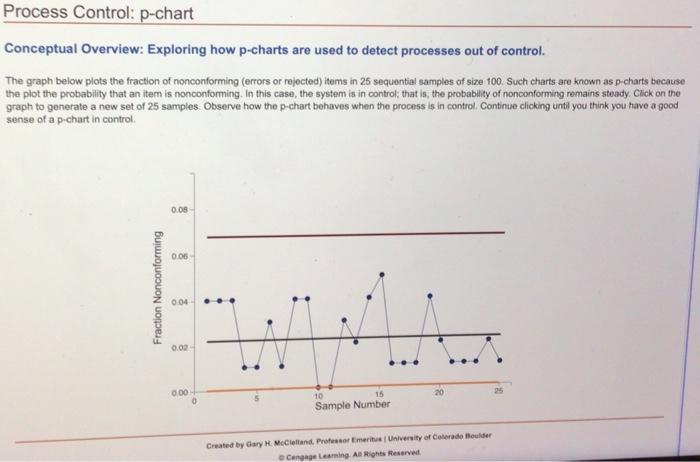
Conceptual Overview: Exploring how p-charts are used to detect processes out of control. The graph below plots the fraction of nonconforming (errors or rejected) items in 25 sequential samples of size 100 . Such charts are known as p-charts because the plot the probability that an item is nonconforming. In this case, the system is in control; that is, the probability of nonconforming remains steady. Crick on the graph to generate a new set of 25 samples. Observe how the p-chart behaves when the process is in control. Continue clicking untli you think you have a good sense of a p-chart in control. 1. In a p-chart, which of the following is least indicative of a process that is in controi? a. There are about as many points above the center line as there are points above it. b. Most points are near the center line. c. The points tend to trend higher from left to right. d. The points appear to be randomly above and below the center ine. 2. In a p-chart, which of the following is most accurate? a. The centerine is always equidistant between the fower limit line and the upper limit line b. The lower limit line is never less than zero. c. In general, the closer the points are to the center line, the closer the upper limit line is to the center line. d. "The fower limit line is never fess than zero" and "In general, the closer the points are to the center line, the closer the upper limet line is to the center line" are accurate
Step by Step Solution
There are 3 Steps involved in it

Get step-by-step solutions from verified subject matter experts