

Question: G J K N 0 Q U w Instructions: For WSI whorksheet: 1 - For only CANADA, Insert GRAPH that compare between UNIT SOLD for
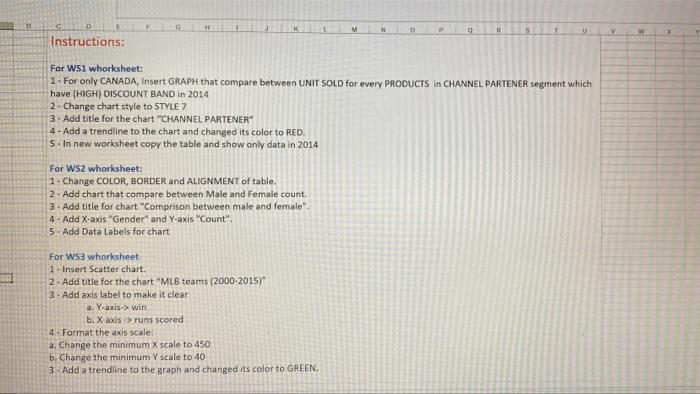
G J K N 0 Q U w Instructions: For WSI whorksheet: 1 - For only CANADA, Insert GRAPH that compare between UNIT SOLD for every PRODUCTS in CHANNEL PARTENER segment which have (HIGH) DISCOUNT BAND in 2014 2 - Change chart style to STYLE 7 3 - Add title for the chart "CHANNEL PARTENER" 4 - Add a trendline to the chart and changed its color to RED. 5 - In new worksheet copy the table and show only data in 2014 For WS2 whorksheet: 1 - Change COLOR, BORDER and ALIGNMENT of table. 2. Add chart that compare between Male and female count. 3. Add title for chart "Comprison between male and female". 4 - Add X-axis "Gender" and Y-axis "Count", 5 - Add Data Labels for chart For WS3 whorksheet 1. Insert Scatter chart. 2 - Add title for the chart "MLB teams (2000-2015) 3 - Add axis label to make it clear a. Y-axis->win b. X-axis > runs scored 4 - Format the axis scale: a. Change the minimum X scale to 450 b. Change the minimum Y scale to 40 3- Add a trendline to the graph and changed its color to GREEN
Step by Step Solution
There are 3 Steps involved in it

Get step-by-step solutions from verified subject matter experts