

Question: ( ggplot) Please answer by R studio. NOTE : The needed data are in this link: https://github.com/wampeh1/Ecog314_Spring2017/tree/master/lecture7 This could not be answered without R studio
(ggplot)
Please answer by R studio. NOTE : The needed data are in this link: https://github.com/wampeh1/Ecog314_Spring2017/tree/master/lecture7
This could not be answered without R studio
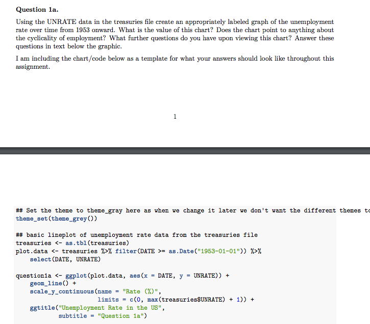
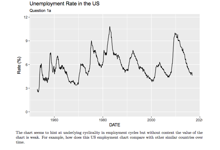
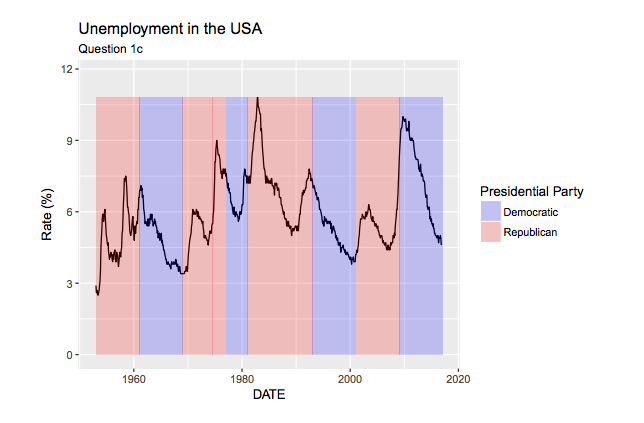
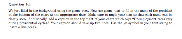
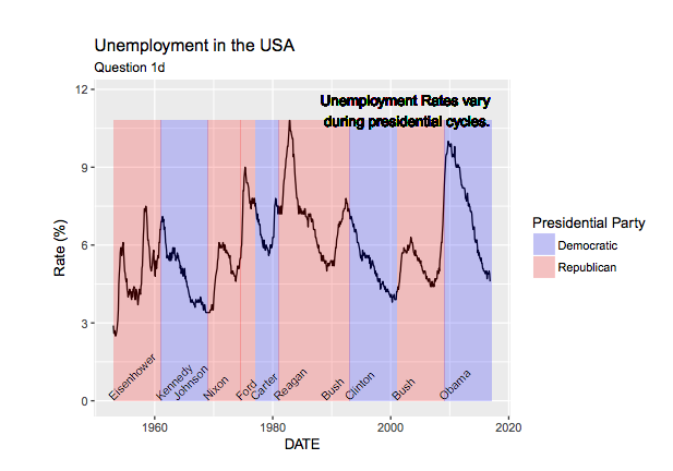
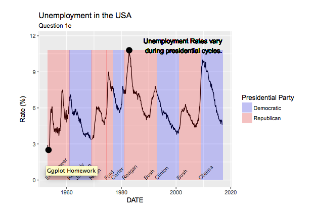
Question 1a. Using the UNRATE data in the treasuries file create an appropriately labeled graph of the unemployment rate over time from 1953 onward. What is the value of this chart? Does the chart point to anything about the cyclicality of employment? What further questions do you have upon viewing this chart? Answer these questions in text below the graphic I am including the chart/code below as a template for what your answers should look like throughout this assignment. Set the theme to theme-gray here as when we change it later we don't want the different themes to theme set (theme grey basic lineplot of unemployment rate data from the treasuries file treasuries as.tbl (treasuries plots data K- treasuries filter (DATE as .Date 1953-01-01 select (DATE, UNRATE) question 1a ggplot lot (data, aes (x DATE y UNRATE)) geom line scale y continuous (name Rate limits c (0, max (treasuries$UNRATE) 1)) ggtitle Unemployment Rate in the US subtitle "Question 1a" Question 1a. Using the UNRATE data in the treasuries file create an appropriately labeled graph of the unemployment rate over time from 1953 onward. What is the value of this chart? Does the chart point to anything about the cyclicality of employment? What further questions do you have upon viewing this chart? Answer these questions in text below the graphic I am including the chart/code below as a template for what your answers should look like throughout this assignment. Set the theme to theme-gray here as when we change it later we don't want the different themes to theme set (theme grey basic lineplot of unemployment rate data from the treasuries file treasuries as.tbl (treasuries plots data K- treasuries filter (DATE as .Date 1953-01-01 select (DATE, UNRATE) question 1a ggplot lot (data, aes (x DATE y UNRATE)) geom line scale y continuous (name Rate limits c (0, max (treasuries$UNRATE) 1)) ggtitle Unemployment Rate in the US subtitle "Question 1a
Step by Step Solution
There are 3 Steps involved in it

Get step-by-step solutions from verified subject matter experts