

Question: Hello, could I get help with the type of graph this is please. Would this be a scatter plot? With an Interpretation of it and
Hello, could I get help with the type of graph this is please. Would this be a scatter plot?
With an Interpretation of it and the explanation on the relationship it shows so I can understand the graph please.
and an explanation on the outlier (Mexico) if possible? thank you very much.
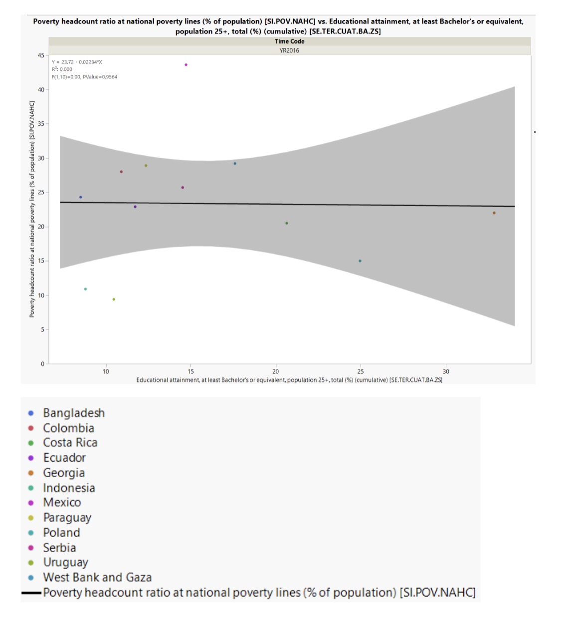
Poverty headcount ratio at national poverty lines (% of population) [SI.POV.NAHC] vs. Educational attainment, at least Bachelor's or equivalent, population 25+, total (%) (cumulative) [SE.TER.CUAT.BA.ZS] Time Code YR2016 15 Y = 23.72 - 0.02234*X R : 0.000 F(1, 10) =0.00, PValue=0,9564 40 Poverty headcount ratio at national poverty lines (% of population) [SI.POV.NAHC] 35 30 25 20 15 0 10 15 20 25 30 Educational attainment, at least Bachelor's or equivalent, population 25+, total (%) (cumulative) [SE.TER.CUAT.BA.ZS] . Bangladesh . Colombia . Costa Rica . Ecuador . Georgia . Indonesia Mexico Paraguay Poland Serbia . Uruguay . West Bank and Gaza - Poverty headcount ratio at national poverty lines (% of population) [SI.POV.NAHC]
Step by Step Solution
There are 3 Steps involved in it

Get step-by-step solutions from verified subject matter experts