

Question: help please! Identify how the following visualization may be misleading. The data has been manipulated. The wrong type of visualization was used. The axis does
help please! 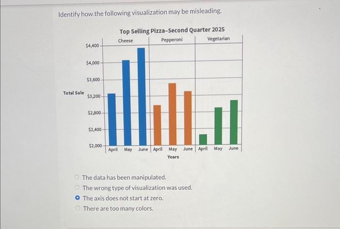
Identify how the following visualization may be misleading. The data has been manipulated. The wrong type of visualization was used. The axis does not start at zero. There are too many colors
Step by Step Solution
There are 3 Steps involved in it
1 Expert Approved Answer
Step: 1 Unlock

Question Has Been Solved by an Expert!
Get step-by-step solutions from verified subject matter experts
Step: 2 Unlock
Step: 3 Unlock