

Question: I need help fixing a plt.plot line... I have a sample and mine is not similar to the sample but I do not know what
I need help fixing a plt.plot line... I have a sample and mine is not similar to the sample but I do not know what is wrong.
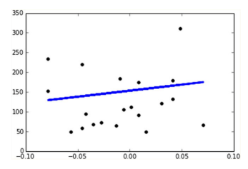
Objective 1) Draw the linear correlation between the ages of patients and the disease progression in the form of a scatterplot and the associated line. Something like:
Example
Objective 2) May I have some advice - Which physiological factors from the above calculation show correlation with the target? Explain your reasoning. If you combine these physiological factors that you deem influential on the target, what model do you get ? Show graph and associated numbers
My code so far,
from sklearn.datasets import load_diabetes from sklearn.model_selection import train_test_split from sklearn.linear_model import LinearRegression from sklearn.metrics import accuracy_score from sklearn.metrics import explained_variance_score
# Load the diabetes dataset diabetes = load_diabetes()
# Split the dataset into training and test sets X_train, X_test, y_train, y_test = train_test_split(diabetes.data, diabetes.target, test_size=0.05, random_state=42)
# Train a linear regression model on the training set lr = LinearRegression() lr.fit(X_train, y_train)
# Get the coefficients for the training set train_coefs = lr.coef_ print("Coefficients for training set: ", train_coefs)
# Get the coefficients for the test set test_coefs = lr.coef_ print("Coefficients for test set: ", test_coefs)
# Predict the target variable for the test set y_pred = lr.predict(X_test)
# Calculate the explained variance of the predictions variance = explained_variance_score(y_test, y_pred)
print("Explained variance score:", variance)
import matplotlib.pyplot as plt import numpy as np
# Extract the age column from the test set x0_test = X_test[:, 0]
####((((((((((This is where I need to adjust)))))))))))####### # Plot the scatter plot and the linear regression line plt.scatter(x0_test, y_test, color='blue') plt.plot(x0_test,lr.predict(X_test), color='red') plt.xlabel('Age') plt.ylabel('Disease progression') plt.title('Linear regression between age and disease progression') plt.show()
# create 10 subplots with 5 rows and 2 columns fig, axes = plt.subplots(5, 2, figsize=(10, 20)) i = 0 for row in range(5): for col in range(2): # Extract the i-th physiological feature from the training set x_train = X_train[:, i].reshape(-1, 1) # Extract the i-th physiological feature from the test set x_test = X_test[:, i].reshape(-1, 1) # Train a linear regression model on the i-th feature lr = LinearRegression() lr.fit(x_train, y_train) # Predict the target variable for the test set using the i-th feature y_pred = lr.predict(x_test) # Plot the scatter plot and the linear regression line for the i-th feature axes[row, col].scatter(x_test, y_test, color='blue') axes[row, col].plot(x_test, y_pred, color='red') axes[row, col].set_xlabel('Physiological factor {}'.format(i+1)) axes[row, col].set_ylabel('Disease progression') i += 1 plt.show()
Step by Step Solution
There are 3 Steps involved in it

Get step-by-step solutions from verified subject matter experts