

Question: I'm not sure how to interpret this graph. The first drop down is Saving/Investment the second is increases/decreases the third one is greater/less the fourth
I'm not sure how to interpret this graph. The first drop down is "Saving/Investment" the second is "increases/decreases" the third one is "greater/less" the fourth is "surplus/shortage" the fifth is "raise/lower" the sixth is "increasing/decreasing" and the last one is "increasing/decreasing" please explain thoroughly in your response! Thank you!
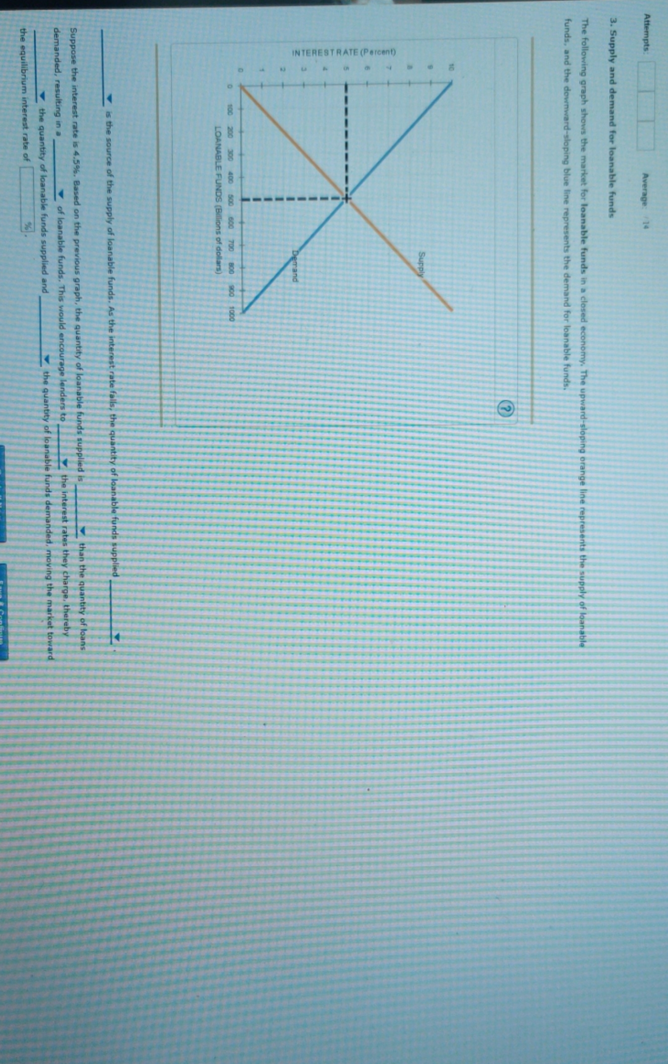
Attempts: Average: /14 3. Supply and demand for loanable funds The following graph shows the market for loanable funds in a closed economy. The upward-sloping orange lin funds, and the downward-sloping blue line represents the demand for loanable funds. INTERESTRATE (Percent) 100 200 300 400 500 600 700 800 900 1000 LOANABLE FUNDS (Billions of dollars) is the source of the supply of loanable funds. As the in Suppose the interest rate is 4.5%, Based on the previous graph, the quantity of loanable funds supplied is than the quantity of loans demanded, resulting in a_ of loanable funds, This would encourage lenders to the interest rates they charge, thereby the quantity of loanable funds supplied and the quantity of loanable funds demanded, moving the market toward the equilibrium interest rate of %
Step by Step Solution
There are 3 Steps involved in it

Get step-by-step solutions from verified subject matter experts