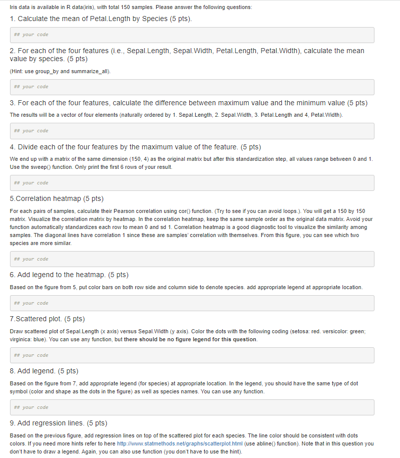
Question: Iris data is available in R data(iris), with total 150 samples. Please answer the following questions: 1. Calculate the mean of Petal. Length by Species


Iris data is available in R data(iris), with total 150 samples. Please answer the following questions: 1. Calculate the mean of Petal. Length by Species (5 pts). ## your code 2. For each of the four features (i.e., Sepal.Length, Sepal.Width, Petal. Length, Petal.Width), calculate the mean value by species. (5 pts) (Hint: use group_by and summarize_all). ## your code 3. For each of the four features, calculate the difference between maximum value and the minimum value (5 pts) The results will be a vector of four elements (naturally ordered by 1. Sepal Length, 2. Sepal.Width, 3. Petal.Length and 4, Petal.Width). ## your code 4. Divide each of the four features by the maximum value of the feature. (5 pts) We end up with a matrix of the same dimension (150, 4) as the original matrix but after this standardization step, all values range between 0 and 1. Use the sweep() function. Only print the first 6 rows of your result. ## your code 5. Correlation heatmap (5 pts) For each pairs of samples, calculate their Pearson correlation using cor() function. (Try to see if you can avoid loops.). You will get a 150 by 150 matrix. Visualize the correlation matrix by heatmap. In the correlation heatmap, keep the same sample order as the original data matrix. Avoid your function automatically standardizes each row to mean 0 and sd 1. Correlation heatmap is a good diagnostic tool to visualize the similarity among samples. The diagonal lines have correlation 1 since these are samples' correlation with themselves. From this figure, you can see which two species are more similar. ## your code 6. Add legend to the heatmap. (5 pts) Based on the figure from 5, put color bars on both row side and column side to denote species. add appropriate legend at appropriate location. ## your code 7.Scattered plot. (5 pts) Draw scattered plot of Sepal.Length (x axis) versus Sepal.Width (y axis). Color the dots with the following coding (setosa: red. versicolor. green; virginica: blue). You can use any function, but there should be no figure legend for this question. ## your code B. Add legend. (5 pts) Based on the figure from 7, add appropriate legend (for species) at appropriate location. In the legend, you should have the same type of dot symbol (color and shape as the dots in the figure) as well as species names. You can use any function. ## your code 9. Add regression lines. (5 pts) Based on the previous figure, add regression lines on top of the scattered plot for each species. The line color should be consistent with dots colors. If you need more hints refer to here http://www.statmethods.net/graphs/scatterplot.html (use abline() function). Note that in this question you don't have to draw a legend. Again, you can also use function (you don't have to use the hint)
Step by Step Solution
There are 3 Steps involved in it

Get step-by-step solutions from verified subject matter experts


