

Question: Need help with how to enter & graph this into excel. I know what the graph is supposed to look like, but I cannot figure
Need help with how to enter & graph this into excel.
I know what the graph is supposed to look like, but I cannot figure out what I need to do in excel to acheive that.
DIRECTONS:
drift inbreeding over time in a population is defined by the equation: FST1 = 1/2N + FST0 (1-(1/2N))
where N = population size. The value in each generation is impacted by the FST of the previous generation (i.e., the equation is applied iteratively over time). explore the effect of population size on drift inbreeding by graphing FST over 20 generations for four different population sizes. Population sizes should be column headings and generations should be listed in rows (start with generation 0). Y ou must use populations of size 5, 10, 100, and 1000, and begin with an initial FST value of 0 for each population. To add multiple data series to the same graph, right-click inside your graph, choose Select Data > Add, then highlight the X and Y values of the data series you wish to add to your original graph. Name all the series with their population sizes in this same locationWhen you include the legend you will see these labels instead of Series 1, etc
This is what the graph should look like, I just need to know what to enter to make that happen.
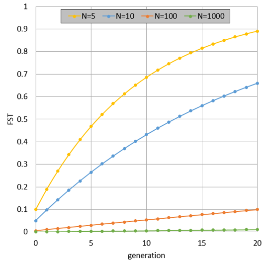
1 N=5 N=10 N=100 N=1000 0.9 0.8 0.7 0.6 0.5 0.4 0.3 0.2 0.1 0 0 5 15 20 10 generation
Step by Step Solution
There are 3 Steps involved in it

Get step-by-step solutions from verified subject matter experts