

Question: . Place a checkmark in the Labels checkbox. Be sure that the Constant is Zero checkbox is NOT checked. . Select the New Worksheet Ply
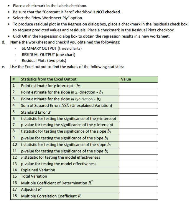


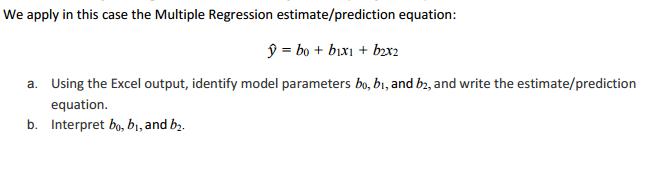
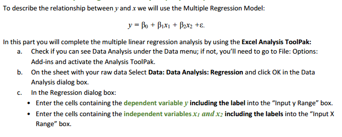
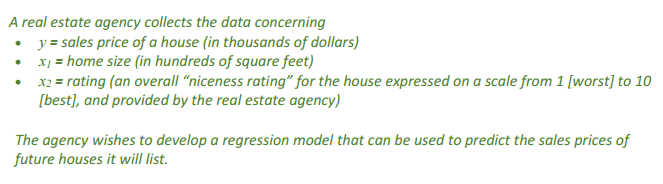


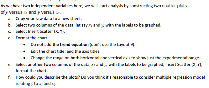


. Place a checkmark in the Labels checkbox. Be sure that the "Constant is Zero" checkbox is NOT checked. . Select the "New Worksheet Ply" option. To produce residual plot in the Regression dialog box, place a checkmark in the Residuals check box to request predicted values and residuals. Place a checkmark in the Residual Plots checkbox. . Click OK in the Regression dialog box to obtain the regression results in a new worksheet. d. Name the worksheet and check if you obtained the followings: SUMMARY OUTPUT (three charts) RESIDUAL OUTPUT (one chart) Residual Plots (two plots) e. Use the Excel output to find the values of the following statistics: # Statistics from the Excel Output Value 1 Point estimate for y-intercept - bo Point estimate for the slope in x, direction - by 3 Point estimate for the slope in x2 direction - by 4 Sum of Squared Errors SSE (Unexplained Variation) 5 Standard Error S 6 t statistic for testing the significance of the y-intercept 7 p-value for testing the significance of the y-intercept 8 t statistic for testing the significance of the slope by p-value for testing the significance of the slope by 10 t statistic for testing the significance of the slope by 11 p-value for testing the significance of the slope by 12 F statistic for testing the model effectiveness 13 p-value for testing the model effectiveness 14 Explained Variation 15 Total Variation 16 Multiple Coefficient of Determination R 17 Adjusted R- 18 Multiple Correlation Coefficient R' _'_ _' ______' ' '___ l__ l__"'__f As we have two independent variabla here, we will start analysis by constructing two scatter plots of y versus 3. and _y versus :1. a. Copy your raw data to a new sheet. b. Select two columns of the data, let says: and y, with the labels to be graphed. c. Select Insert Scatter (it. '1'}. d Format the chart: 1- Do not add the trend equation [don't use the Layout 9}. 1- Edit the chart title, and the axis titles. 1- Ehange the range on both horizontal and vertical axis to show just the experimental range. e. Select another two columns of the data. 1;: and y, with the labels to be graphed; Insert Scatter [11. '1']; format the chart. f. How could you describe the plots? Do you think it's reasonable to consider multiple regression model relating y to x; and :3. \fWe apply in this case the Multiple Regression estimate/prediction equation: 9 = bo + bix1 + bzx2 a. Using the Excel output, identify model parameters bo, bi, and by, and write the estimate/prediction equation. b. Interpret bo, b1, and by.To describe the relationship between y and x we will use the Multiple Regression Model: = Bo + PIXI + B2x2 +E. In this part you will complete the multiple linear regression analysis by using the Excel Analysis ToolPak: a. Check if you can see Data Analysis under the Data menu; if not, you'll need to go to File: Options: Add-ins and activate the Analysis ToolPak. b. On the sheet with your raw data Select Data: Data Analysis: Regression and click OK in the Data Analysis dialog box. C. In the Regression dialog box: . Enter the cells containing the dependent variable J' including the label into the "Input y Range" box. . Enter the cells containing the independent variables x7 and x2 including the labels into the "Input X Range" box.A real estate agency collects the data concerning y = sales price of a house (in thousands of dollars) x1 = home size (in hundreds of square feet) x2 = rating (an overall "niceness rating" for the house expressed on a scale from 1 [worst] to 10 [best], and provided by the real estate agency) The agency wishes to develop a regression model that can be used to predict the sales prices of future houses it will list.c. Calculate a point estimate/prediction of the mean sales price of all houses having 2, 000 square feet and a rating of 8
Step by Step Solution
There are 3 Steps involved in it

Get step-by-step solutions from verified subject matter experts