

Question: Please code HTML and CSS for this file: start from Scratch. Please make it simple and unique from the ones which are already in the
Please code HTML and CSS for this file: start from Scratch. Please make it simple and unique from the ones which are already in the chegg
For this assignment we will make our existing resume website responsive to a variety of devices. To do this we will simply modify the existing external stylesheet and add in the necessary meta tag to our HTML. The new page will rearrange our three content divs so that when viewed on mobile they are no longer side-by-side, and are now centered, have an increased width, and an adjusted height for the links div to fit better on a mobile device.
1 Add the viewport meta tag to each HTML file in the head
2) Rearrange the layout so that at 575px the three divs that are next to each other (floating) are no longer next to each other and they look better on mobile devices.
a. Within CSS, add in the @media only screen and max width rule similar. Instead of having the body selector as in the example, you will need to add in your three existing class names for the three divs. Then you can define what happens to these classes when the screen is below 575px in width. Set the float to none and then copy over all of the other style from outside of the @media rule for the three divs.
b. In addition, set the margins for these divs to auto to center them. Also, change the width to 90% so that they look better.
c. Change the height of the div containing your links to be a better height
3) You can preview the responsiveness in two ways. a. Most simply, you can resize your browser window. When the size gets below 575px, the new style will apply. b. You can also simulate a mobile device in Google Chromes developer tools (there are similar tools for other browsers also). Access these by selecting the three dots in the upper right corner of Google Chrome, then selecting more tools and then developer tools. Then select the Toggle device toolbar and adjust the pixel width and height in the toolbar or select a device from the dropdown to see how your page respondes.
It should looks like this
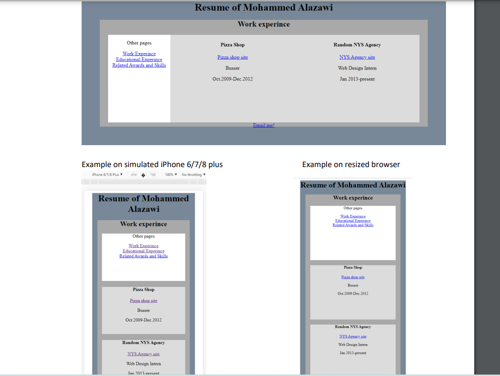
Example on simulated iPhone 6/7/8 plus Example on resized browser
Step by Step Solution
There are 3 Steps involved in it

Get step-by-step solutions from verified subject matter experts
 Study Help