

Question: Please help with these excel questions! Develop an excel worksheet by following the directions below: Generating a plot with Excel Excel is a ubiquitous spreadsheet
Please help with these excel questions! Develop an excel worksheet by following the directions below:
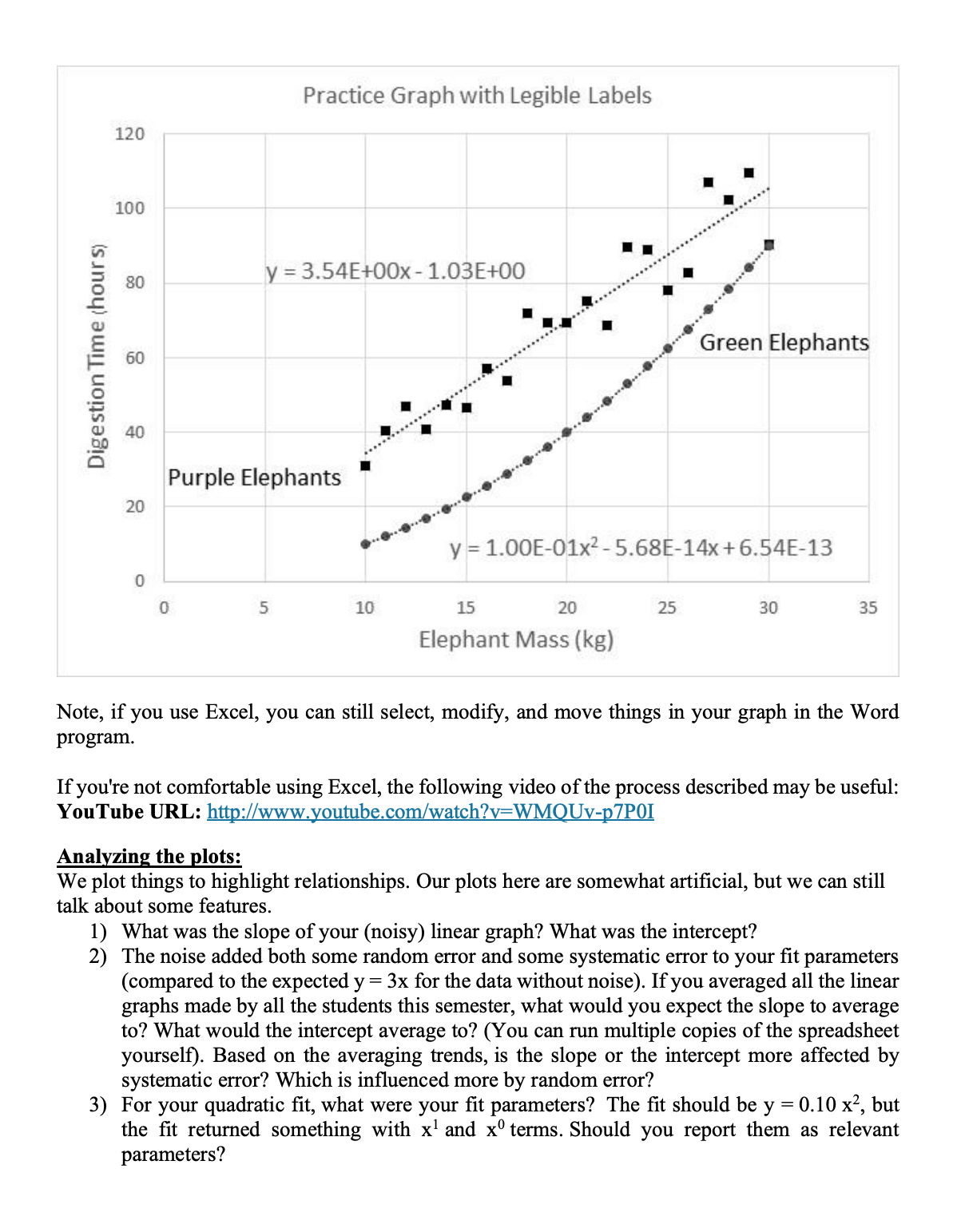
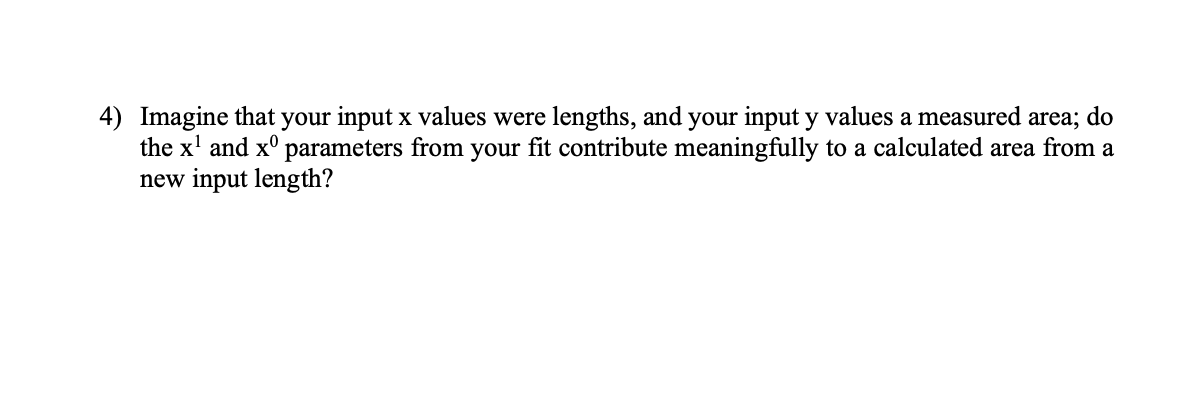
Generating a plot with Excel Excel is a ubiquitous spreadsheet program that you may already be familiar with. Lets do one plot to get familiar with Excel. 1) 2) 3) 4) 5) 6) 7) Open a blank workbook in Excel. We'll denote what you're supposed to type by putting it inside brackets. Don't enter the brackets. In cell BZ enter . In cell B3 enter . Select and hover the mouse over the bottom right corner of B3 (should be a small black plus), click and drag down to I322. You should have a column of numbers from 10 to 30. In cell C2, enter . Click and drag down through C22. In D2, enter . Click and drag down through D22. In E2 enter , click and drag down to E22 (note RAND changes every time Excel performs an operation on the sheet). Select Insert, and pick a scatter chart. Right click in the chart area and select \"Select Data\". Edit Seriesl, and select BZ:B22 for the X values and E2:22 for the Y values. Left click on the data points to select them, then right click on them so you can select \"Add Trendline\". Right click on the trendline to select \"Format Trendline\Practice Graph with Legible Labels 120 100 . . .........so............ 80 y = 3.54E+00x - 1.03E+00 ... . ..... Digestion Time (hour s) 60 Green Elephants ......' 40 Purple Elephants 20 y = 1.00E-01x2 - 5.68E-14x + 6.54E-13 5 10 15 20 25 30 35 Elephant Mass (kg) Note, if you use Excel, you can still select, modify, and move things in your graph in the Word program. If you're not comfortable using Excel, the following video of the process described may be useful: YouTube URL: http://www.youtube.com/watch?v=WMQUv-p7POI Analyzing the plots: We plot things to highlight relationships. Our plots here are somewhat artificial, but we can still talk about some features. 1) What was the slope of your (noisy) linear graph? What was the intercept? 2) The noise added both some random error and some systematic error to your fit parameters (compared to the expected y = 3x for the data without noise). If you averaged all the linear graphs made by all the students this semester, what would you expect the slope to average to? What would the intercept average to? (You can run multiple copies of the spreadsheet yourself). Based on the averaging trends, is the slope or the intercept more affected by systematic error? Which is influenced more by random error? 3) For your quadratic fit, what were your fit parameters? The fit should be y = 0.10 x2, but the fit returned something with x and x terms. Should you report them as relevant parameters?4) Imagine that your input x values were lengths, and your input y values a measured area; do the x1 and x0 parameters from your t contribute meaningfully to a calculated area from a new input length
Step by Step Solution
There are 3 Steps involved in it

Get step-by-step solutions from verified subject matter experts