

Question: Please make 3 graphs and upload them on pdf files. GRAPHICAL REPRESENTATIONS OF EXPERIMENTAL DATA INTRODUCTION: Plots are the most common way of presenting data.
 Please make 3 graphs and upload them on pdf files.
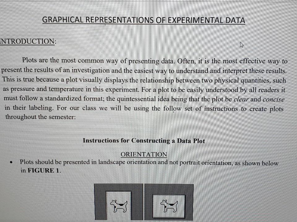
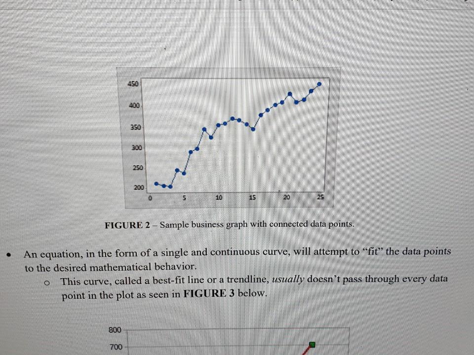
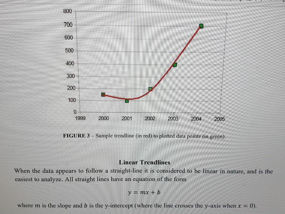
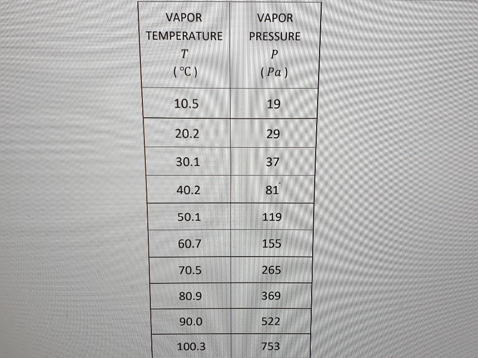
GRAPHICAL REPRESENTATIONS OF EXPERIMENTAL DATA INTRODUCTION: Plots are the most common way of presenting data. Often, it is the most effective way to present the results of an investigation and the easiest way to understand and interpret these results. This is true because a plot visually displays the relationship between two physical quantities, such as pressure and temperature in this experiment. For a plot to be easily understood by all readers it must follow a standardized format; the quintessential idea being that the plot be clear and concise in their labeling. For our class we will be using the follow set of instructions to create plots throughout the semester: Instructions for Constructing a Data Plot . ORIENTATION Plots should be presented in landscape orientation and not portrait orientation, as shown below in FIGURE 1. O TITLE Describe which part of the experiment that the data comes from. Use words, not abbreviations or mathematical symbols. O AXES Describe the plotted variable. o Use words, not abbreviations or mathematical symbols. Within parentheses, describe the units of the plotted variable. Use the appropriate abbreviation or mathematical symbols, not words. CURVE FITTING Don't use a series of straight-line segments to connect successive data points, as shown below in FIGURE 2. This is often done in business but never done in science. O 450 400 350 300 250 200 10 15 20 25 FIGURE 2 - Sample business graph with connected data points. An equation, in the form of a single and continuous curve, will attempt to "fit" the data points to the desired mathematical behavior. This curve, called a best-fit line or a trendline, usually doesn't pass through every data point in the plot as seen in FIGURE 3 below. 800 700 800 700 600 500 400 300 200 100 0 1999 2000 2001 2002 2003 2004 2005 FIGURE 3 - Sample trendline (in red) to plotted data points (in green). Linear Trendlines When the data appears to follow a straight-line it is considered to be linear in nature, and is the easiest to analyze. All straight lines have an equation of the form y = mx + b where m is the slope and b is the y-intercept (where the line crosses the y-axis when x = 0). Nonlinear Trendlines There are many different trendlines that can be fitted to data which are not linear. These curves are classified as being nonlinear. The power law function y = ax" is one example of a nonlinear curve, where a a constant coefficient is and n is an exponent to the variable x. Computer software, such as Microsoft Excel or Google Sheets, will aide in determining the appropriate values for all numerical coefficients. The theory within an experiment will aide in determining the appropriate value of the function's exponent. PROCEDURE: 1. First Graph a. Create a plot of pressure versus temperature using the data in the DATA TABLE below. Give the plot an appropriate title, such as Non-Ideal Gas Law Data. Insert a linear trendline that isn't forced to go through the origin. Display the trendline equation displayed and the R-squared value directly beneath the graph's title. b. Save the graph as a PDF. 2. Second Graph Create another plot using the same data as the first plot. a. U. Dave the grapi as arur. 2. Second Graph a. Create another plot using the same data as the first plot. Label the graph appropriately. Insert a quadratic trendline that isn't forced to go through the origin. Display the trendline equation displayed and the R-squared value directly beneath the graph's title. b. Save the graph as a PDF. 3. Third Graph a. Create another plot using the same data as the first plot. Label the graph appropriately. Insert a cubic trendline that isn't forced to go through the origin. Display the trendline equation displayed and the R-squared value directly beneath the graph's title. b. Save the graph as a PDF. VAPOR TEMPERATURE T (C) VAPOR PRESSURE P (Pa) 10.5 19 20.2 29 30.1 37 40.2 81 50.1 119 60.7 155 70.5 265 80.9 369 90.0 522 100.3 753
Step by Step Solution
There are 3 Steps involved in it

Get step-by-step solutions from verified subject matter experts