

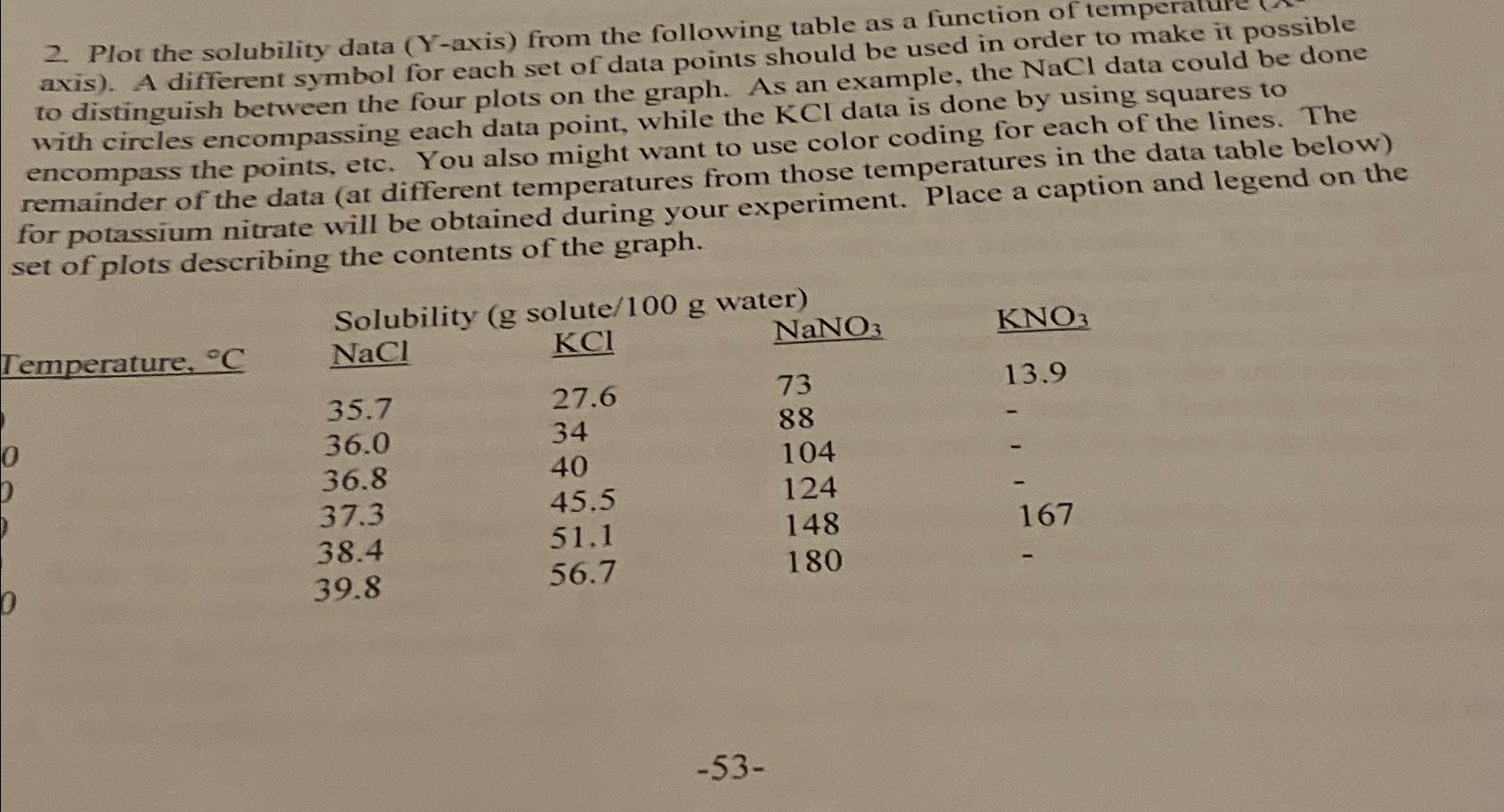
Question: Plot the solubility data ( Y - axis ) from the following table as a function of temperake it possible axis ) . A different
Plot the solubility data Yaxis from the following table as a function of temperake it possible axis A different symbol for each set of data points should be used in NaCl data could be done to distinguish between the four plots on the graph. As an example, the by using squares to with circles encompassing each data point, while the data is dong for each of the lines. The encompass the points, etc. You also might want to use color coding forates in the data table below remainder of the data at different temperatures from those temperace a caption and legend on the set of plots describing the contents of the graph.
Temperature,
Step by Step Solution
There are 3 Steps involved in it
1 Expert Approved Answer
Step: 1 Unlock

Question Has Been Solved by an Expert!
Get step-by-step solutions from verified subject matter experts
Step: 2 Unlock
Step: 3 Unlock