

Question: point(s) possible Use the given qualitative data to construct the relative frequency distribution. The 2324 people aboard a ship that sank include 276 male survivors,
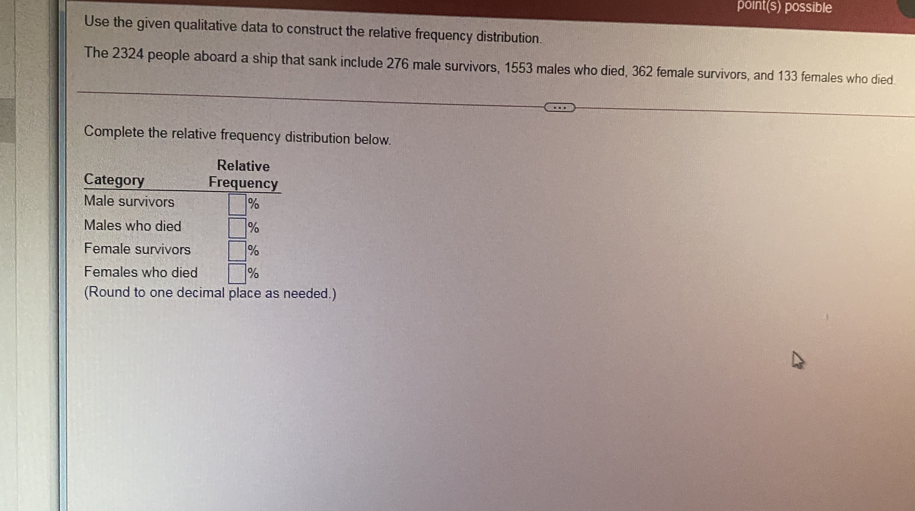
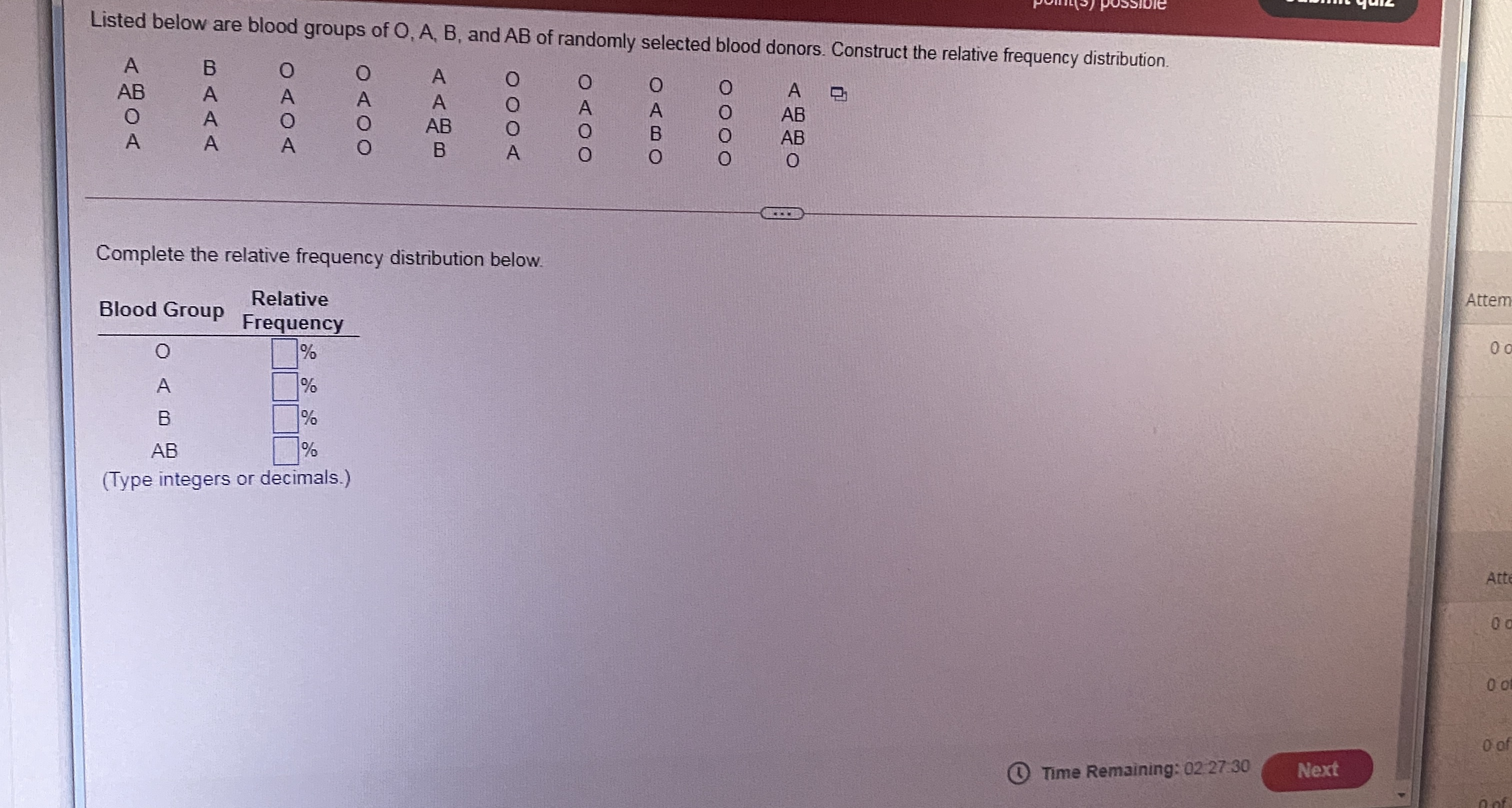
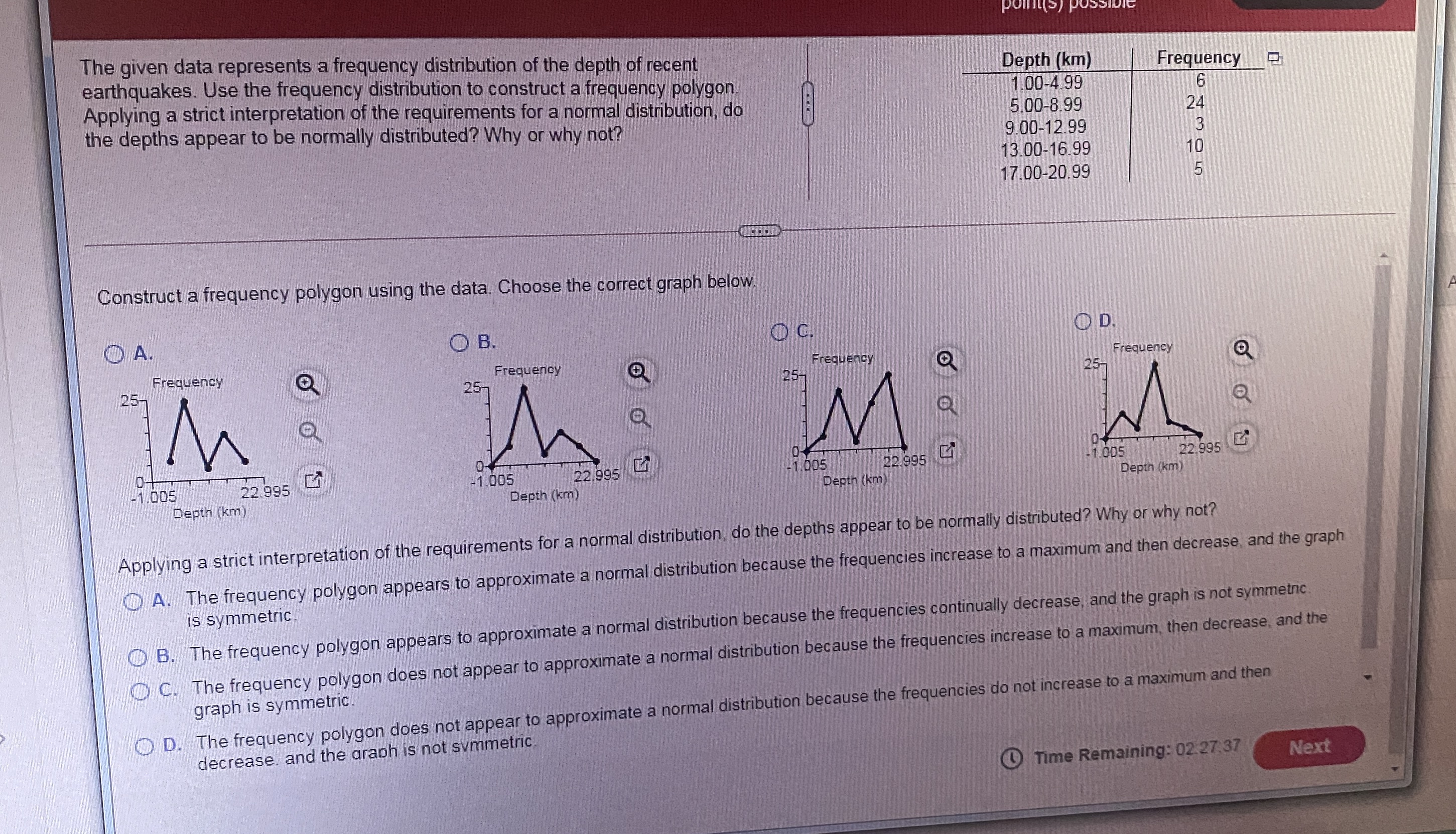
point(s) possible Use the given qualitative data to construct the relative frequency distribution. The 2324 people aboard a ship that sank include 276 male survivors, 1553 males who died, 362 female survivors, and 133 females who died. Complete the relative frequency distribution below. Relative Category Frequency Male survivors % Males who died Female survivors % Females who died % (Round to one decimal place as needed.)Listed below are blood groups of O, A, B, and AB of randomly selected blood donors. Construct the relative frequency distribution. A B A AB A DODO OODO AB DOOO O OODO A OUDO AB A A B O Complete the relative frequency distribution below. Attem Relative Blood Group Frequency O % A % B % AB % (Type integers or decimals.) Att 0 of Time Remaining: 02 27 30 Nextpoint(s) The given data represents a frequency distribution of the depth of recent earthquakes. Use the frequency distribution to construct a frequency polygon Depth (km) Frequency Applying a strict interpretation of the requirements for a normal distribution, do 1.00-4.99 6 the depths appear to be normally distributed? Why or why not? 5.00-8.99 24 9.00-12.99 13.00-16.99 10 17.00-20.99 Construct a frequency polygon using the data. Choose the correct graph below OA. O B. O D. Frequency Frequency Frequency Frequency 25- 25- 25- 25- M E -1.005 22.995 -1.005 22.995 -1.005 22.995 -1 005 22.995 Depth (km Depth (km) Depth (km) Depth (km) Applying a strict interpretation of the requirements for a normal distribution, do the depths appear to be normally distributed? Why or why not? A. The frequency polygon appears to approximate a normal distribution because the frequencies increase to a maximum and then decrease, and the graph is symmetric. @B. The frequency polygon appears to approximate a normal distribution because the frequencies continually decrease, and the graph is not symmetric C. The frequency polygon does not appear to approximate a normal distribution because the frequencies increase to a maximum, then decrease, and the graph is symmetric. O D. The frequency polygon does not appear to approximate a normal distribution because the frequencies do not increase to a maximum and then decrease. and the graph is not symmetric Time Remaining: 02 27 37 Next
Step by Step Solution
There are 3 Steps involved in it

Get step-by-step solutions from verified subject matter experts