

Question: TED Talk managers are preparing a presentation on the history of TED Talks. They need some help developing some important visual aids. Specifically, they want
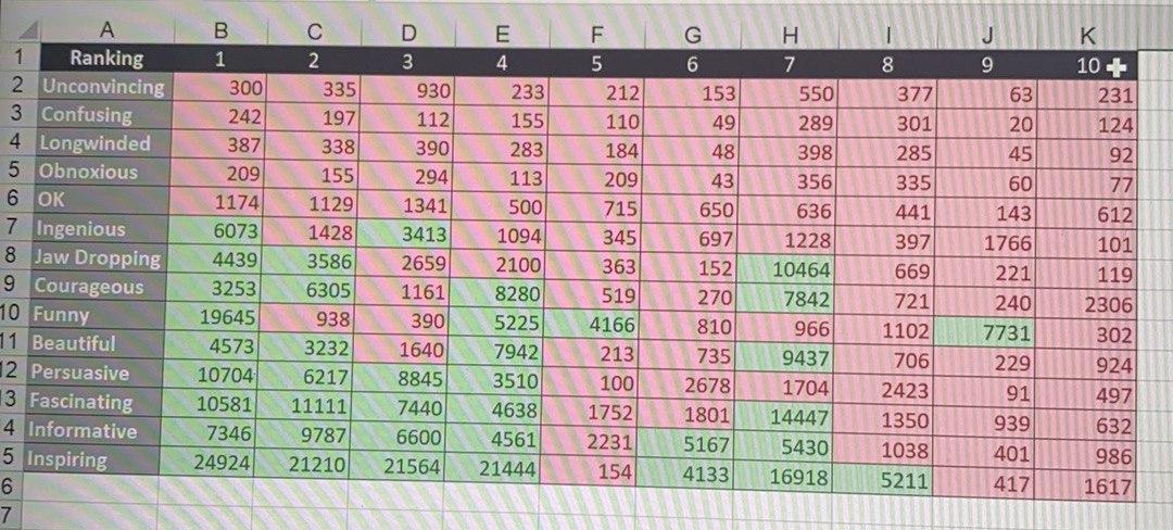
- TED Talk managers are preparing a presentation on the history of TED Talks. They need some help developing some important visual aids. Specifically, they want a color-coded chart that shows how certain descriptive tags seems to cluster together for the higher ranked videos. Using the provided spreadsheet of the top 10 TED Talks and their descriptive tags, use a series of conditional formatting and then manual sorting to create visual clusters to visually show how the top-ranked videos are tagged by viewers. Create a visual aid that shows the descriptive qualities that best define the top-ranked videos. \
Detailed Instructions:
- Download the spreadsheet, TED Talk Activity.xlsx. Refer to Q2 sheet in the spreadsheet.
- Using conditional formatting, have the descriptive tag counts that are above average display with a green background and those with below average count display with a red background.
- Manually group rows together (using copy and paste) until you have stacked the colors together as much as possible. (Hint: insert a blank row before you move one, so you do not accidentally delete any data.) Note that although there is no right or wrong way to stack the rows, you want to stack them so that the colors tell the most compelling story.
****very important*****i need the answers of all these following question and you have to use visual Paradigm Online - Suite of Powerful Tools (visual-paradigm.com) toanswer the Questions (15 Marks):
- i. Submit your excel file including the visualized table. (6 Marks).
- How many times was Inspiring tagged for the top ranked video (3 Marks)?
- How many times was OK above average (3 Marks)?
- How many times was Funny above average (3 Marks)?
Step by Step Solution
There are 3 Steps involved in it
1 Expert Approved Answer
Step: 1 Unlock

Question Has Been Solved by an Expert!
Get step-by-step solutions from verified subject matter experts
Step: 2 Unlock
Step: 3 Unlock