

Question: TED Talk managers are preparing a presentation on the history of TED Talks. They need some help developing some important visual aids. Specifically, they want
TED Talk managers are preparing a presentation on the history of TED Talks. They need some help developing some important visual aids. Specifically, they want a color-coded chart that shows how certain descriptive tags seem to cluster together for the higher-ranked videos. Using the provided spreadsheet of the top 10 TED Talks and their descriptive tags, use a series of conditional formatting and then manual sorting to create visual clusters to visually show how the top-ranked videos are tagged by viewers. Create a visual aid that shows the descriptive qualities that best define the top-ranked videos.
Detailed Instructions:
- Download the spreadsheet, TED Talk Activity.xlsx. Refer to the Q2 sheet in the spreadsheet.
- Using conditional formatting, have the descriptive tag counts that are above average display with a green background and those with below average count display with a red background.
- Manually group rows together (using copy and paste) until you have stacked the colors together as much as possible. (Hint: insert a blank row before you move one, so you do not accidentally delete any data.) Note that although there is no right or wrong way to stack the rows, you want to stack them so that the colors tell the most compelling story.
Questions:
- Submit your excel file including the visualized table. (6 Marks).
- How many times was “Inspiring” tagged for the top ranked video (3 Marks)?
- How many times was “OK” above average (3 Marks)?
- How many times was “Funny” above average (3 Marks)?
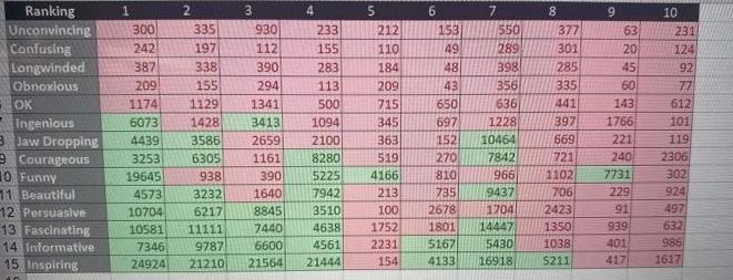
Ranking Unconvincing Confusing Longwinded Obnoxious OK 1 30 Funny 11 Beautiful 12 Persuasive 13 Fascinating 14 Informative 15 Inspiring 300 242 1174 Ingenious 5073 3 Jaw Dropping 4439 Courageous 3253 387 209 19645 4573 3 335 930 197 112 338 390 155 294 1129 1341 1428 3413 3586 2659 6305 1161 938 390 1640 3232 10704 6217 10581 11111 7346 9787 24924 21210 8845 7440 6600 21564 4 233 155 283 113 500 1094 2100 8280 $225 7942 3510 4638 4561 21444 5 212 110 184 209 715 345 363 519 4166 213 100 1752 2231 154 6 7 153 550 49 289 48 398 43 356 650 636 697 1228 152 10464 270 7842 810 966 735 9437 00 2678 1801 14447 5167 5430 4133 16918 8 1704 2423 1350 1038 5211 9 377 301 285 335 441 143 397 1766 669 221 721 240 1102 7731 706 229 91 63 20 45 60 939 401 417 10 231 124 92 77 612 101 119 2306 302 924 497 632 986 1617
Step by Step Solution
There are 3 Steps involved in it
How many times was Inspiring tagged for the top ranked video 3 Marks 24924 times How many times was ... View full answer

Get step-by-step solutions from verified subject matter experts