

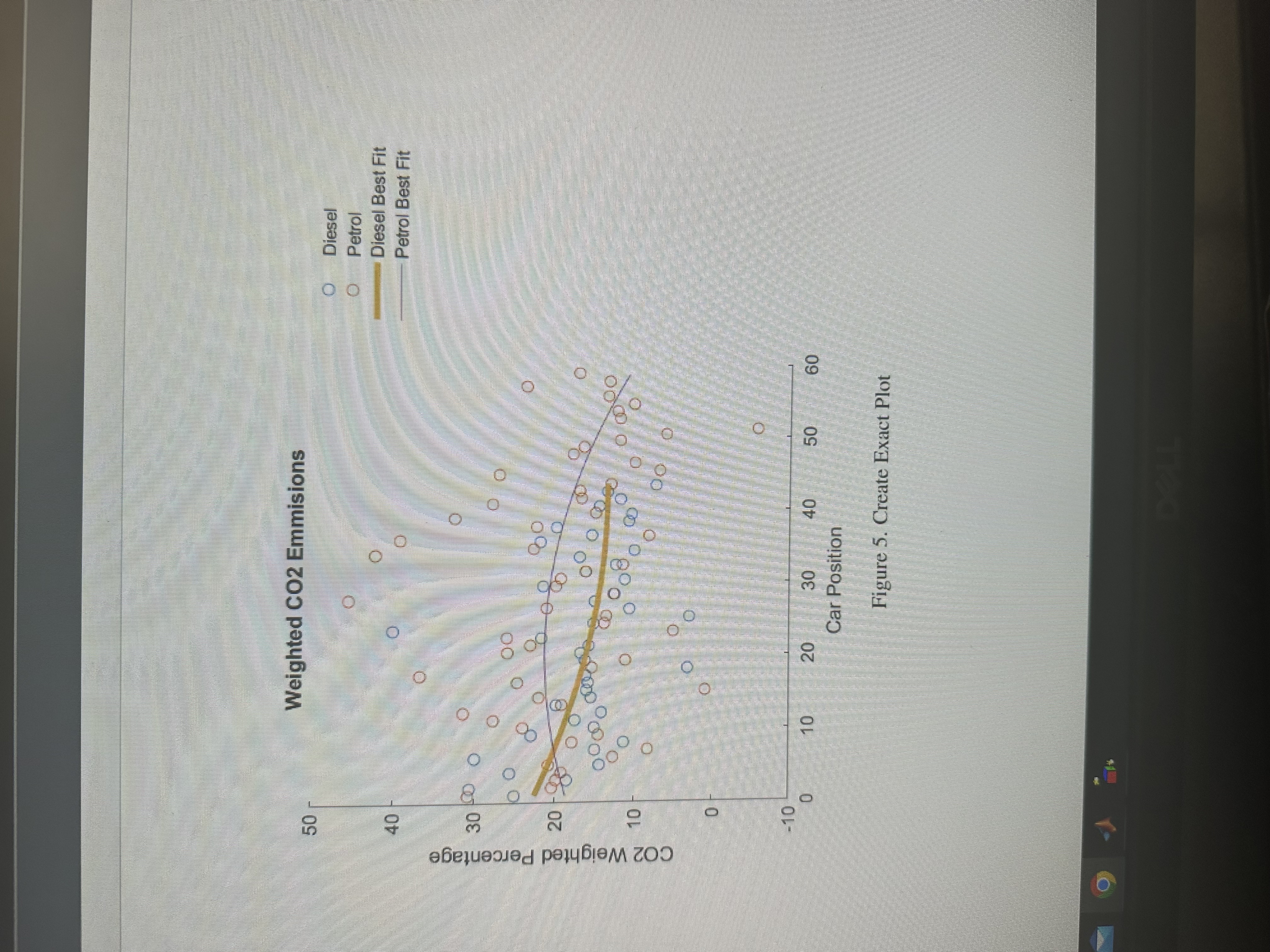
Question: The code that you see run a similar graph but it is not exactly that same as the graph that you see on the picture.
The code that you see run a similar graph but it is not exactly that same as the graph that you see on the picture. Could you please run this code on matlab and fix the code so that it runs the same graph you see on the picture. I want the curve of the lines and the color of the lines exactly the same. Also could you make the blue and oragne circles a little bit more spread out just like you see on the picture. Basically just make the same
graph that you see on the picture.
Fix this code on matlab.
Sample data for Diesel and PetrolcarPosition linspace; CO emissions for DieselCODiesel coscarPositionpirand; CO emissions for PetrolCOPetrol sincarPositionpirand; Fit polynomial curvespDiesel polyfitcarPosition CODiesel, ;pPetrol polyfitcarPosition COPetrol, ; Generate points for best fit linesfitDiesel polyvalpDiesel carPosition;fitPetrol polyvalpPetrol carPosition; Plotting the datafigure;hold on;scattercarPosition CODiesel, o 'MarkerEdgeColor', ; Diesel datascattercarPosition COPetrol, o 'MarkerEdgeColor', ; Petrol dataplotcarPosition fitDiesel, 'Color', 'LineWidth', ; Diesel best fitplotcarPosition fitPetrol, 'Color', 'LineWidth', ; Petrol best fit Customize the plotxlabelCar Position';ylabelCO Weighted Percentage';titleWeighted CO Emissions';legendDiesel 'Petrol', 'Diesel Best Fit', 'Petrol Best Fit';grid on;ylim; Set yaxis limitshold off;
Step by Step Solution
There are 3 Steps involved in it
1 Expert Approved Answer
Step: 1 Unlock

Question Has Been Solved by an Expert!
Get step-by-step solutions from verified subject matter experts
Step: 2 Unlock
Step: 3 Unlock