

Question: The dotplot below shows 2005 U.S. household income. Each dot represents half a million households. Each stack/column of dots is a $10,000 range. For
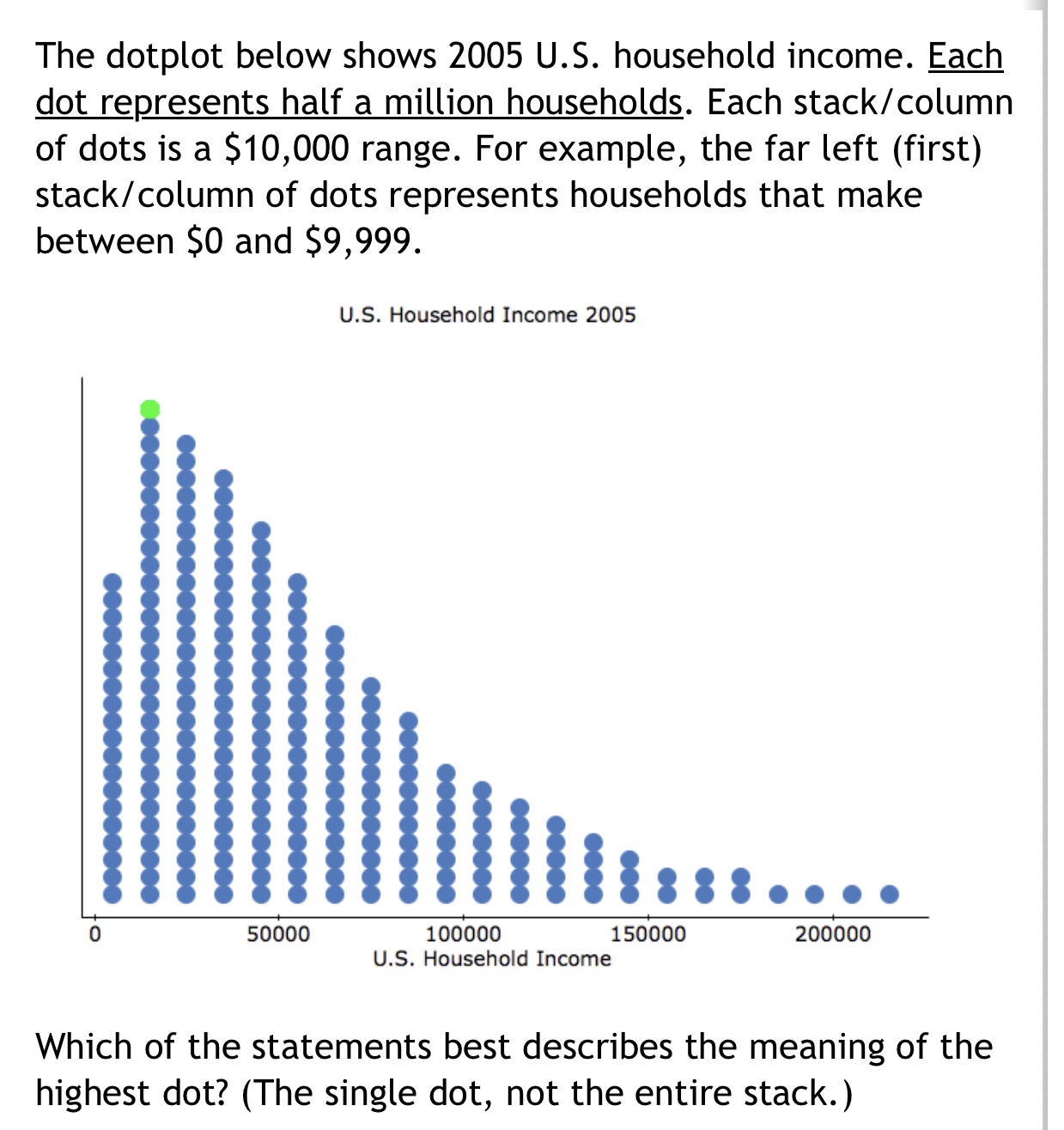
The dotplot below shows 2005 U.S. household income. Each dot represents half a million households. Each stack/column of dots is a $10,000 range. For example, the far left (first) stack/column of dots represents households that make between $0 and $9,999. U.S. Household Income 2005 50000 100000 150000 200000 U.S. Household Income Which of the statements best describes the meaning of the highest dot? (The single dot, not the entire stack.)
Step by Step Solution
There are 3 Steps involved in it
1 Expert Approved Answer
Step: 1 Unlock

Question Has Been Solved by an Expert!
Get step-by-step solutions from verified subject matter experts
Step: 2 Unlock
Step: 3 Unlock