

Question: The dotplot below summarizes life-expectancy data for 188 countries. Each dot details a country's average life expectancy for the year 2015. For example, the
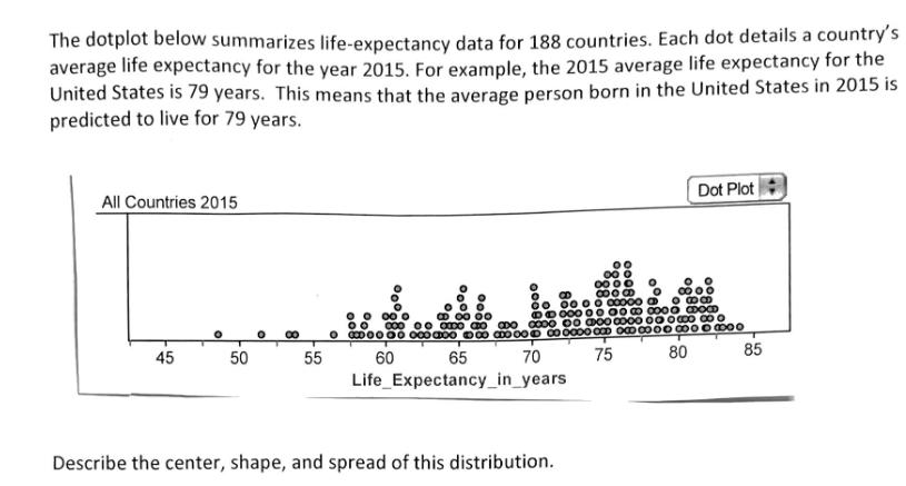
The dotplot below summarizes life-expectancy data for 188 countries. Each dot details a country's average life expectancy for the year 2015. For example, the 2015 average life expectancy for the United States is 79 years. This means that the average person born in the United States in 2015 is predicted to live for 79 years. All Countries 2015 45 50 O 55 000 00 00 0 0000 000000 oo 0000 808 00000000000 B 00000000000 BOOOD CDO 0000 00 00 00 00 00 00 0 00 000 0000 0000 000 000 0000 0000 000 75 80 70 85 65 60 Life Expectancy_in_years Dot Plot Describe the center, shape, and spread of this distribution.
Step by Step Solution
3.45 Rating (165 Votes )
There are 3 Steps involved in it
This dotplot displays the distribution of life expectancy for 188 countries in the year 2015 To desc... View full answer

Get step-by-step solutions from verified subject matter experts