

Question: The following graph shows a decrease in aggregate demand (AD) in a hypothetical country. Specifically, aggregate demand shifts to the left from AD, to AD2,
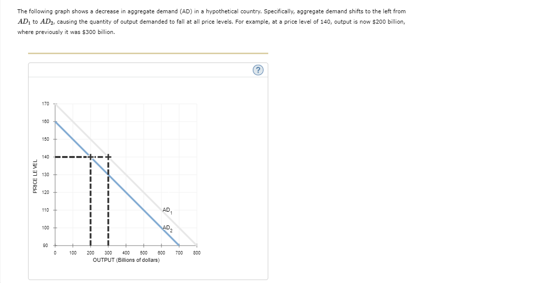
The following graph shows a decrease in aggregate demand (AD) in a hypothetical country. Specifically, aggregate demand shifts to the left from AD, to AD2, causing the quantity of output demanded to fall at all price levels. For example, at a price level of 140, output is now $200 billion, where previously it was $300 billion. 170 180 150 140 + 130 PRICE LEVEL 120 110 AD 100 AD 2 90 100 200 300 400 500 600 700 800 OUTPUT (Billions of dollars)
Step by Step Solution
There are 3 Steps involved in it
1 Expert Approved Answer
Step: 1 Unlock

Question Has Been Solved by an Expert!
Get step-by-step solutions from verified subject matter experts
Step: 2 Unlock
Step: 3 Unlock