

Question: The following scatterplot shows the relationship between waiting times and systolic blood pressures of the survey participants. Waiting Tlmes In ED vs. SBP NHAMCS Data,
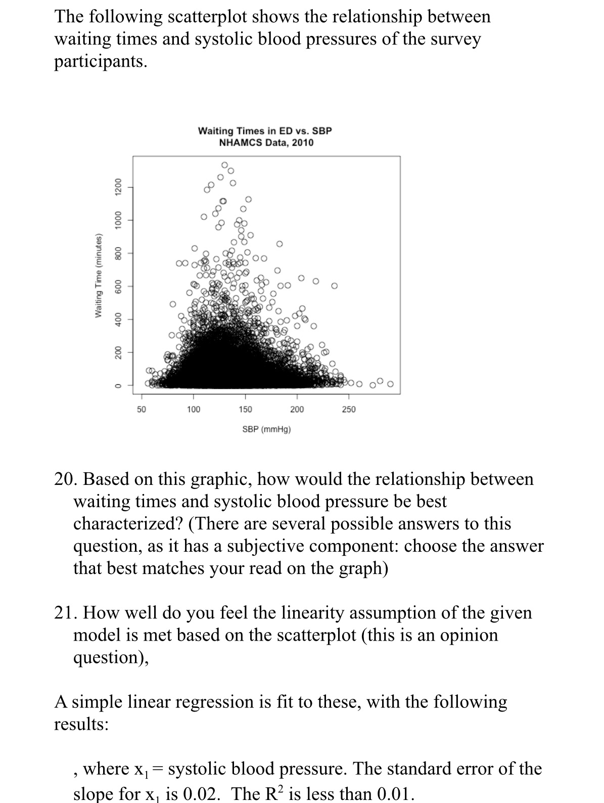
The following scatterplot shows the relationship between waiting times and systolic blood pressures of the survey participants. Waiting Tlmes In ED vs. SBP NHAMCS Data, 2010 Waiting T'rne (minutes) 600 800 1000 1200 400 200 50 100 150 200 250 SBP (mmHg) 20. Based on this graphic, how would the relationship between waiting times and systolic blood pressure be best characterized? (There are several possible answers to this question, as it has a subjective component: choose the answer that best matches your read on the graph) 21. How well do you feel the linearity assumption of the given model is met based on the scatterplot (this is an opinion question), A simple linear regression is t to these, with the following results: , where x1= systolic blood pressure. The standard error of the slope for x1 is 0.02. The R2 is less than 0.01
Step by Step Solution
There are 3 Steps involved in it

Get step-by-step solutions from verified subject matter experts