

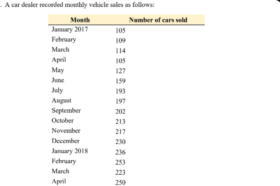
Question: Using Excel to create the chart, add linear trend line and display equation on the chart. The chart should have appropriate vertical and horizontal axis
Using Excel to create the chart, add linear trend line and display equation on the chart. The chart should have appropriate vertical and horizontal axis title.
Run simple regression in Excel to get correlation coefficient and coefficient of determination.
In Excel solution show forecasts for January through July
make sure to show formulas being used in cells
Step by Step Solution
There are 3 Steps involved in it
1 Expert Approved Answer
Step: 1 Unlock

Question Has Been Solved by an Expert!
Get step-by-step solutions from verified subject matter experts
Step: 2 Unlock
Step: 3 Unlock