

Question: Using tableau and the data below, create three graphs to show the correlation Amazon, Walmart and Target for 2019, 2020, 2021 Sales vs Inventory Sales
Using tableau and the data below, create three graphs to show the correlation Amazon, Walmart and Target for 2019, 2020, 2021
Sales vs Inventory
Sales vs Net Income
Sales vs Operating Expenses
 Note: Shown in billions
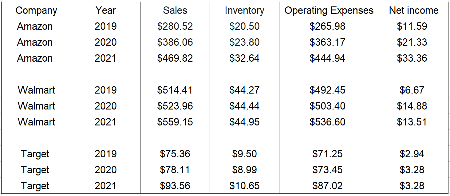
\begin{tabular}{|c|c|c|c|c|c|} \hline Company & Year & Sales & Inventory & Operating Expenses & Net income \\ \hline Amazon & 2019 & $280.52 & $20.50 & $265.98 & $11.59 \\ Amazon & 2020 & $386.06 & $23.80 & $363.17 & $21.33 \\ Amazon & 2021 & $469.82 & $32.64 & $444.94 & $33.36 \\ Walmart & 2019 & $514.41 & $44.27 & $492.45 & $6.67 \\ Walmart & 2020 & $523.96 & $44.44 & $503.40 & $14.88 \\ Walmart & 2021 & $559.15 & $44.95 & $536.60 & $13.51 \\ & & & & & \\ Target & 2019 & $75.36 & $9.50 & $71.25 & $2.94 \\ Target & 2020 & $78.11 & $8.99 & $73.45 & $3.28 \\ Target & 2021 & $93.56 & $10.65 & $87.02 & $3.28 \\ \hline \end{tabular}
Step by Step Solution
There are 3 Steps involved in it
1 Expert Approved Answer
Step: 1 Unlock

Question Has Been Solved by an Expert!
Get step-by-step solutions from verified subject matter experts
Step: 2 Unlock
Step: 3 Unlock