

Question: What type of study is used in the article (quantitative or qualitative)? Explain how you came to that conclusion. What type of graph or table
- What type of study is used in the article (quantitative or qualitative)? Explain how you came to that conclusion.
- What type of graph or table did you choose for your lab (bar graph, histogram, stem & leaf plot, etc.)? What characteristics make it this type (you should bring in material that you learned in the course)?
- Describe the data displayed in your frequency distribution or graph (consider class size, class width, total frequency, list of frequencies, class consistency, explanatory variables, response variables, shapes of distributions, etc.)
- Draw a conclusion about the data from the graph or frequency distribution in context of the article.
- How else might this data have been displayed? Discuss pros and cons of 2 other presentation options, such as tables or different graphical displays. Why don't you think those two graphs were not used in this article?

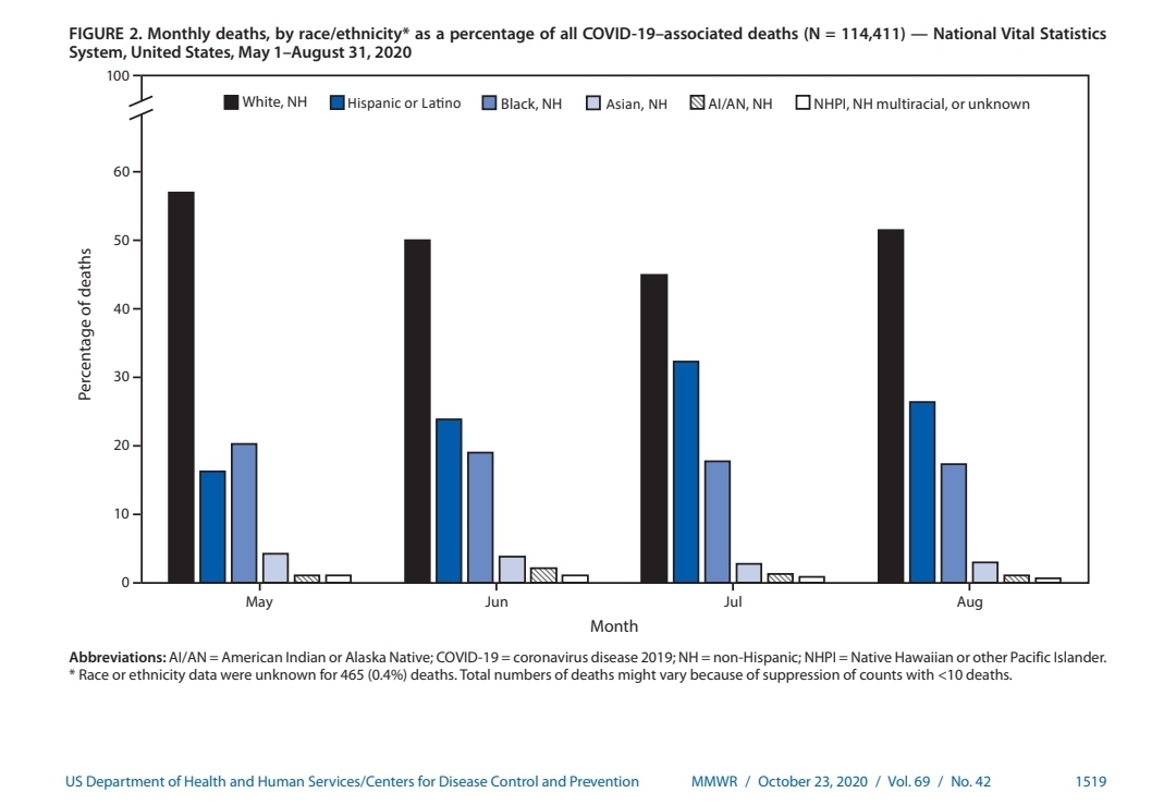
FIGURE 2. Monthly deaths, by race/ethnicity* as a percentage of all COVID-19-associated deaths (N = 114,411) - National Vital Statistics System, United States, May 1-August 31, 2020 100 White, NH Hispanic or Latino Black, NH Asian, NH SAI/AN, NH ONHPI, NH multiracial, or unknown 60- 50- 40- Percentage of deaths 30 - 20 - 10 May Jun Jul Aug Month Abbreviations: Al/AN = American Indian or Alaska Native; COVID-19 = coronavirus disease 2019; NH = non-Hispanic; NHPI = Native Hawaiian or other Pacific Islander. * Race or ethnicity data were unknown for 465 (0.4%) deaths. Total numbers of deaths might vary because of suppression of counts with
Step by Step Solution
There are 3 Steps involved in it

Get step-by-step solutions from verified subject matter experts