

Question: Which chart is used to display the relationship between 2 catagorical variables? Histogram Line chart Scatter plot Cluster column chart Bar chart Which chart is
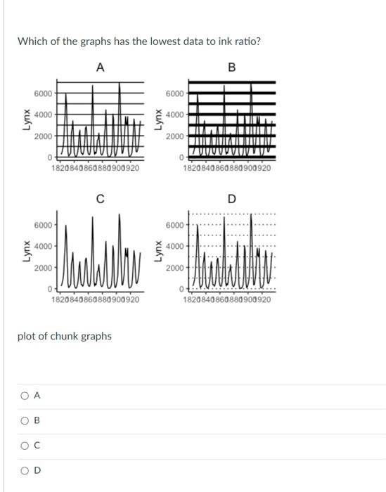
Which chart is used to display the relationship between 2 catagorical variables? Histogram Line chart Scatter plot Cluster column chart Bar chart Which chart is used to display the relationship between 2 numerical variables? Line chart O Histogram O Heat maps Scatter plot Bubble chart Which charts are used to display information about categorical variables? (mark all that apply) Scatter plot Cluster column chart Line chart Bubble chart Heat maps Which of the graphs has the lowest data to ink ratio? A B B 6000 6000 4000 4000 Lynx Lynx 2000 2000 0 0 1820 840860880900920 1820840860880900920 D 6000 6000 4000 4000 Lynx Lynx 2000 2000 0 0 1820840860880900920 1820840860880900920 plot of chunk graphs B D What is the purpose of data visualization? O To show the data and all of its details O To summarize a data set or highlight patterns O To impress your boss O To show off your Excel skills O All of the above
Step by Step Solution
There are 3 Steps involved in it

Get step-by-step solutions from verified subject matter experts