

Tableau Public can also import table data from pdf files. The P04_26.pdf file (from the Bureau of
Question:
Tableau Public can also import table data from pdf files. The P04_26.pdf file (from the Bureau of Labor Statistics) contains two tables. We are interested only in the first table, which contains monthly values of the Consumer Price Index for all urban consumers (the CPI-U index) from 1913 to mid-2018. Proceed as follows:
a. Import the data in Table 1 into Tableau Public. (When you connect to the pdf source file, ask it to scan for All. You will see several items in the left pane. Experiment to see which union of them you need.) There should be 14 columns: Year, a column for each month, and a Table Name column. Hide this last column.
b. It would be better to have only three columns: Year, Month, and CPI. Tableau Public lets you restructure the data in this way with its “pivot” tool. To use it, highlight all month columns and select Pivot from the dropdown arrow above any month heading. The month columns will be collapsed into two long columns, which you can rename Month and CPI.
c. Change the data type of the Year column to Number (whole).
d. Change the data type of CPI to Number (decimal).
e. Dates are tricky to work with in Tableau Public. (See https://onlinehelp.tableau.com/current/pro/desktop/ enus/functions_functions_date.html for help.) The goal here is to calculate a date field called Date, which will be used in a line chart. First, change the data type of Month to Date. Second, click the dropdown arrow above Month and select Create Calculated Field to open a dialog box. Enter MonthNumber for the name of the field, enter the formula Month([Month]) in the body—no equals sign is needed—and click OK.
For example, this returns 4 for April. Finally, create another calculated field named Date with the formula MakeDate([Year] [MonthNumber],1). (This is like Excel’s Date function, which also takes three integer arguments.)
f. Create a line chart of CPI. To do so, first drag CPI from the Dimensions list to the Measures list. (We’re not sure why it is in the Dimensions list.) Then drag Date to the Columns area and CPI to the Rows area and create a Filter for Date on Year. You should see a line chart of CPI by year, but you should then be able to expand the Year(Date) button to Year(Quarter) and then to Year(Month). This is the advantage of having a Date field.
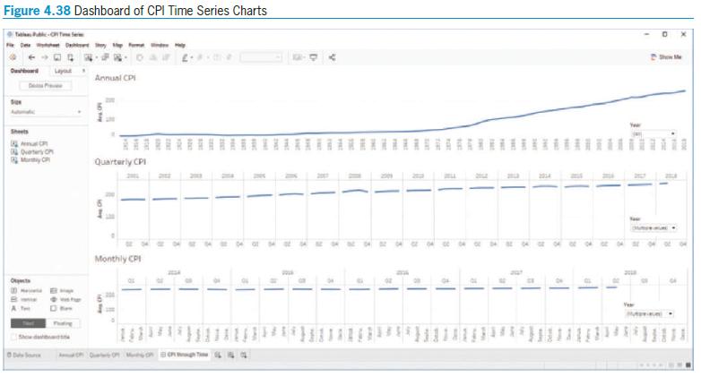
g. Create a dashboard that looks approximately like Figure 4.38, where each chart has its own Year filter.
Figure 4.38
Step by Step Answer:


Business Analytics Data Analysis And Decision Making
ISBN: 9780357109953
7th Edition
Authors: S. Christian Albright, Wayne L. Winston
