

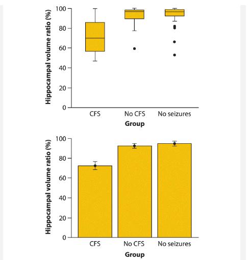
The graphs at the right are from a study investigating hippocampal volume loss in 107 patients with
Question:
The graphs at the right are from a study investigating hippocampal volume loss in 107 patients with drug-resistant epilepsy (Cook et al. 1993). The graphs depict the association between hippocampal volume loss (measured using MRI as the volume of the smaller half of the hippocampus divided by the volume of the larger half, expressed as a percentage) and patient history. Patients were grouped on the basis of whether they had a record of childhood febrile seizures (CFS), childhood non-febrile seizures (no CFS), and no childhood seizures.
a. Which accompanying graph, the box plot (top) or the bar graph (bottom; indicating means and SEs), best depicts the patterns in the data? Why?
b. Which statistical method would you recommend to test whether groups differed in hippocampal volume loss? Why?
Step by Step Answer:
a The box plot because it shows the data It allows us to see the locatio...View the full answer


The Analysis Of Biological Data
ISBN: 9781319226237
3rd Edition
Authors: Michael C. Whitlock, Dolph Schluter
