

Question: The graph in Figure 3.40 shows data regarding the relative risk of schizophrenia among people born in different months. Figure 3.40 a. Note that the
The graph in Figure 3.40 shows data regarding the relative risk of schizophrenia among people born in different months.
Figure 3.40
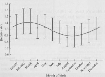
a. Note that the scale of the vertical axis does not include zero. Sketch the same risk curve using an axis that includes zero. Comment on the effect of this change.
b. Each value of the relative risk is shown with a dot at its most likely value and with an "error bar" indicating the range in which the data value probably lies. The study concludes that "the risk was also significantly associated with the season of birth." Given the size of the error bars, does this claim appear justified? (Is it possible to draw a flat line that passes through all of the error bars?)
1.3 1.2 1.1 1.0 0.9 0.8 0.7 0.6 Month of bith
Step by Step Solution
★★★★★
3.43 Rating (166 Votes )
There are 3 Steps involved in it
1 Expert Approved Answer
Step: 1 Unlock

a Using a scale that starts with zero makes the variations appear smaller ... View full answer
Question Has Been Solved by an Expert!
Get step-by-step solutions from verified subject matter experts
Step: 2 Unlock
Step: 3 Unlock
Document Format (1 attachment)
666-M-S-D-A (5626).docx
120 KBs Word File