

Question: The following time-series plot and bar graph both present the sales of digital music for the years 20122015. Which of the graphs presents the more
The following time-series plot and bar graph both present the sales of digital music for the years 2012–2015. Which of the graphs presents the more accurate picture? Why?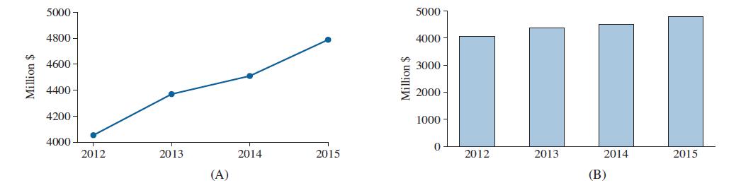
Million $ 5000 4800- 5000 4000 3000 4600 4400 Million $ 2000 4200 1000 4000 2012 0 2013 2014 2015 2012 2013 2014 2015 (A) (B)
Step by Step Solution
★★★★★
3.43 Rating (150 Votes )
There are 3 Steps involved in it
1 Expert Approved Answer
Step: 1 Unlock

Question Has Been Solved by an Expert!
Get step-by-step solutions from verified subject matter experts
Step: 2 Unlock
Step: 3 Unlock