

Question: Here is a mosaic plot of the data on Diet and Politics from Exercise 5 combined with data on Gender. Data From Exercise 5 The
Here is a mosaic plot of the data on Diet and Politics from Exercise 5 combined with data on Gender.
Data From Exercise 5
The survey of 299 undergraduate students from Exercise 86 in Chapter 2 (data in Student Survey) asked about respondents’ diet preference (Carnivore, Omnivore, Vegetarian) and political alignment (Liberal, Moderate, Conservative). Here is a stacked bar chart of the 285 responses:
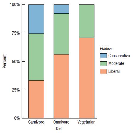
a) Describe what this plot shows using the concept of a conditional distribution.
b) Do you think the differences here are real? Explain.
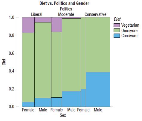
a) Are there more men or women in the survey? Explain briefly.
b) Does there appear to be an association between Politics and Gender?
c) Does there appear to be an association between Politics and Diet?
d) Does the association between Politics and Diet seem to differ between men and women?
Percent 100% 75% 50% 25% 0% Carnivore Omnivore Diet Vegetarian Politics Conservative Moderate Liberal
Step by Step Solution
3.38 Rating (164 Votes )
There are 3 Steps involved in it
a There are more men in the survey The male columns are generally wider than the female columns b We ... View full answer

Get step-by-step solutions from verified subject matter experts