

Question: 8 . This exercise provides a total of 13 data visualizations that describe a real companys performance based on 17 quarters of financial data. The
8. This exercise provides a total of 13 data visualizations that describe a real companys performance based on 17 quarters of financial data. The visualizations are grouped into five dashboards that were created in Tableau: (1) sales analysis, (2) gross margin analysis, (3) operating expense analysis, (4) profitability analysis, and (5) market performance analysis. Required: For each section, review the Tableau visualizations and answer the questions.
Refer to the Profitability Analysis Dashboard below and answer the questions.
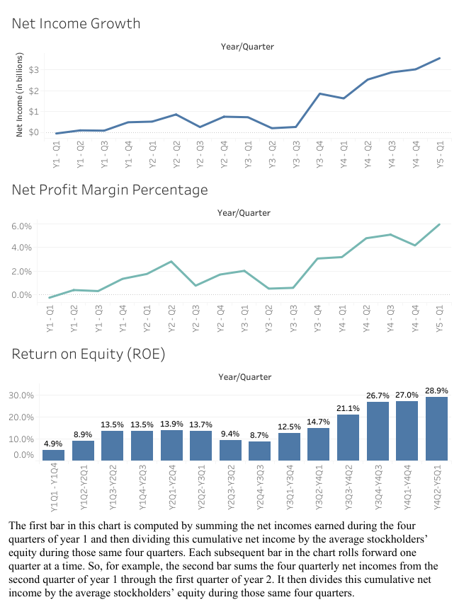
(Note that for all questions below you may select more than one answer. a., b., and/or c.) 8a-1. Which of the following statements are true with respect to Visualization 1: Net Income Growth? check all that apply
a- It provides a trend analysis of quarterly net income as a percent of sales beginning with the first quarter of year 1 and running consecutively through the first quarter of year 5.
b- It provides a trend analysis of quarterly net income beginning with the first quarter of year 1 and running consecutively through the first quarter of year 5.
c- It provides a trend analysis of quarterly net income as a percent of stockholders equity beginning with the first quarter of year 1 and running consecutively through the first quarter of year 5.
8a-2. Which of the following statements are true with respect to Visualization 2: Net Profit Margin Percentage? check all that apply
a- It provides a trend analysis of quarterly net income as a percent of sales beginning with the first quarter of year 1 and running consecutively through the first quarter of year 5.
b- It provides a trend analysis of quarterly net income beginning with the first quarter of year 1 and running consecutively through the first quarter of year 5.
c- It provides a trend analysis of quarterly net income as a percent of stockholders equity beginning with the first quarter of year 1 and running consecutively through the first quarter of year 5.
8a-3. Which of the following statements are true with respect to Visualization 3: Return on Equity (ROE)? check all that apply
a- It provides a trend analysis of quarterly net income as a percent of sales beginning with the first quarter of year 1 and running consecutively through the first quarter of year 5
b- It provides a trend analysis of quarterly net income beginning with the first quarter of year 1 and running consecutively through the first quarter of year 5
c- It provides a trend analysis of quarterly net income as a percent of stockholders equity beginning with the first quarter of year 1 and running consecutively through the first quarter of year 5.
8b-1. Which of the following statements are true with respect to Visualization 1: Net Income Growth? check all that apply
a- The net income never exceeded $1 billion between the first quarter of year 1 and the third quarter of year 3.
b- The net income increased every quarter from the fourth quarter of year 3 until the first quarter of year 5.
c- The net income hit its highest peak during the 17-month span during the first quarter of year 5.
8b-2. Which of the following statements are true with respect to Visualization 2: Net Profit Margin Percentage? check all that apply
a- The net profit margin percentage never dropped below 2% between the fourth quarter of year 3 and the first quarter of year 5.
b- The net profit margin percentage dropped from the second quarter of year 2 to the third quarter of year 2.
c- The net profit margin percentage never exceeded 2% between the first quarter of year 1 and the third quarter of year 3
8b-3. Which of the following statements are true with respect to Visualization 3: Return on Equity (ROE)? check all that apply
a- The return on equity ranges from 4.9% to 28.9%.
b- The return on equity is higher towards the end of the 17-quarter time period than it is at the beginning of this time period
c- The return on equity has increased every quarter from the beginning to the end of the 17-quarter period depicted in the chart.
8c. Which of the following statements are true with respect to the three visualizations contained in the Profitability Analysis Dashboard? check all that apply
a- A trend analysis of net income growth and net profit margin percentage reveal that the two measures have been moving in opposite directions over the course of the 17-quarter period.
b- The third visualization is the only one of the three that looks at net income relative to the owners investment.
c- All three visualizations indicate improving performance from the third quarter of year 3 through the first quarter of year 5.
9. This exercise provides a total of 13 data visualizations that describe a real companys performance based on 17 quarters of financial data. The visualizations are grouped into five dashboards that were created in Tableau: (1) sales analysis, (2) gross margin analysis, (3) operating expense analysis, (4) profitability analysis, and (5) market performance analysis. Required: For each section, review the Tableau visualizations and answer the questions.
Refer to the Market Performance Analysis below and answer the questions.
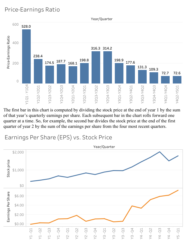
(Note that for all questions below you may select more than one answer. a., b., and/or c.) 9a-1. Which of the following statements are true with respect to Visualization 1: Price-Earnings Ratio? check all that apply
a- The chart depicts the companys stock price relative to its net profit margin percentage
b- Each bar in the chart is calculated using that quarters stock price divided by the cumulative earnings per share for the most recently completed four quarters.
c- The chart provides a trend analysis of the companys price-earnings ratio from the end of year 1 through the first quarter of year 5.
9a-2. Which of the following statements are true with respect to Visualization 2: Earnings Per Share (EPS) vs. Stock Price? check all that apply
a- The bottom-half of the visualization provides a trend analysis of the companys earnings per share beginning with the first quarter of year 1 and running consecutively through the first quarter of year 5.
b- The top and bottom halves of the visualization provide a year-over-year depiction of stock price and earnings per share beginning with the first quarter of years 1-5 and ending with the fourth quarter of years 1-4.
c- The top-half of the visualization provides a trend analysis of the companys stock price beginning with the first quarter of year 1 and running consecutively through the first quarter of year 5.
9b-1. Which of the following statements are true with respect to Visualization 1: Price-Earnings Ratio? check all that apply
a- The price-earnings ratio jumped by more than 100 at one point during years 2 and 3.
b- The price-earnings ratio has declined from 528.0 in the first quarter of year 1 to 72.6 by the first quarter of year 5.
c- The last eight blue bars indicate a steady decline in the price-earnings ratio.
9b-2. Which of the following statements are true with respect to Visualization 2: Earnings Per Share (EPS) vs. Stock Price? check all that apply
a- The companys stock price has increased over the 17-month period whereas its earnings per share have decreased.
b- The companys earnings per share experienced its biggest quarterly increase from the third quarter to the fourth quarter of year 3.
c- The companys earnings per share experienced its biggest decrease from the second quarter to the third quarter of year 3.
9c. Which of the following statements are true with respect to the two visualizations contained in the Market Performance Analysis Dashboard? check all that apply
a- The stock price was higher at the end of the third quarter of year 3 compared to the same quarter in the prior year; however, the earnings per share was the same in the third quarter of years 2 and 3.
b- The second visualization suggests that the companys plummeting earnings per share in years 4 and 5 is largely responsible for the drop in the price-earnings ratio depicted in the first visualization.
c- The second visualization separately depicts the numerator and denominator that comprise the measure depicted in the first visualization.
Net Income Growth Net Profit Margin Percentage Keturn on tquicy (KU) The first bar in this chart is computed by summing the net incomes earned during the four quarters of year 1 and then dividing this cumulative net income by the average stockholders' equity during those same four quarters. Each subsequent bar in the chart rolls forward one quarter at a time. So, for example, the second bar sums the four quarterly net incomes from the second quarter of year 1 through the first quarter of year 2. It then divides this cumulative net income by the average stockholders' equity during those same four quarters. Price-Earnings Ratio The first bar in this chart is computed by dividing the stock price at the end of year 1 by the sum of that year's quarterly earnings per share. Each subsequent bar in the chart rolls forward one quarter at a time. So, for example, the second bar divides the stock price at the end of the first quarter of year 2 by the sum of the earnings per share from the four most recent quarters. Earninos Per Share (EPS) vs. Stock Price
Step by Step Solution
There are 3 Steps involved in it

Get step-by-step solutions from verified subject matter experts