

Question: A) the pie chart is correctB) the bar chart is correctC) both are correctD) neither are correct X me Left:2:16:19 Brittany Callahan: Attempt 1 Connecticut
A) the pie chart is correctB) the bar chart is correctC) both are correctD) neither are correct
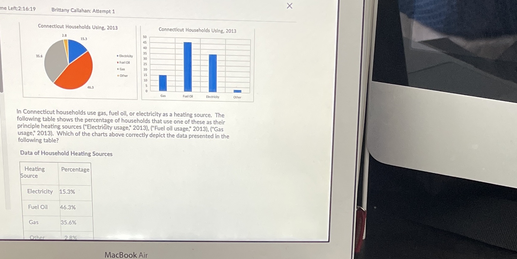
X me Left:2:16:19 Brittany Callahan: Attempt 1 Connecticut Households Using, 2013 Connecticut Households Using, 2013 2.8 15.3 35.6 Electricity . Fuel Oil Gas 20 . Other Gas Fuel Oil Electricity Other In Connecticut households use gas, fuel oil, or electricity as a heating source. The following table shows the percentage of households that use one of these as their principle heating sources ("Electridity usage," 2013), ("Fuel oil usage," 2013), ("Gas usage," 2013). Which of the charts above correctly depict the data presented in the following table? Data of Household Heating Sources Heating Percentage Source Electricity 15.3% Fuel Oil 46.3% Gas 35.6% Other 2 8%% MacBook Air
Step by Step Solution
There are 3 Steps involved in it

Get step-by-step solutions from verified subject matter experts