

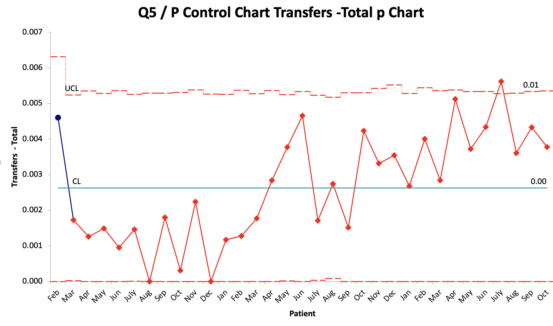
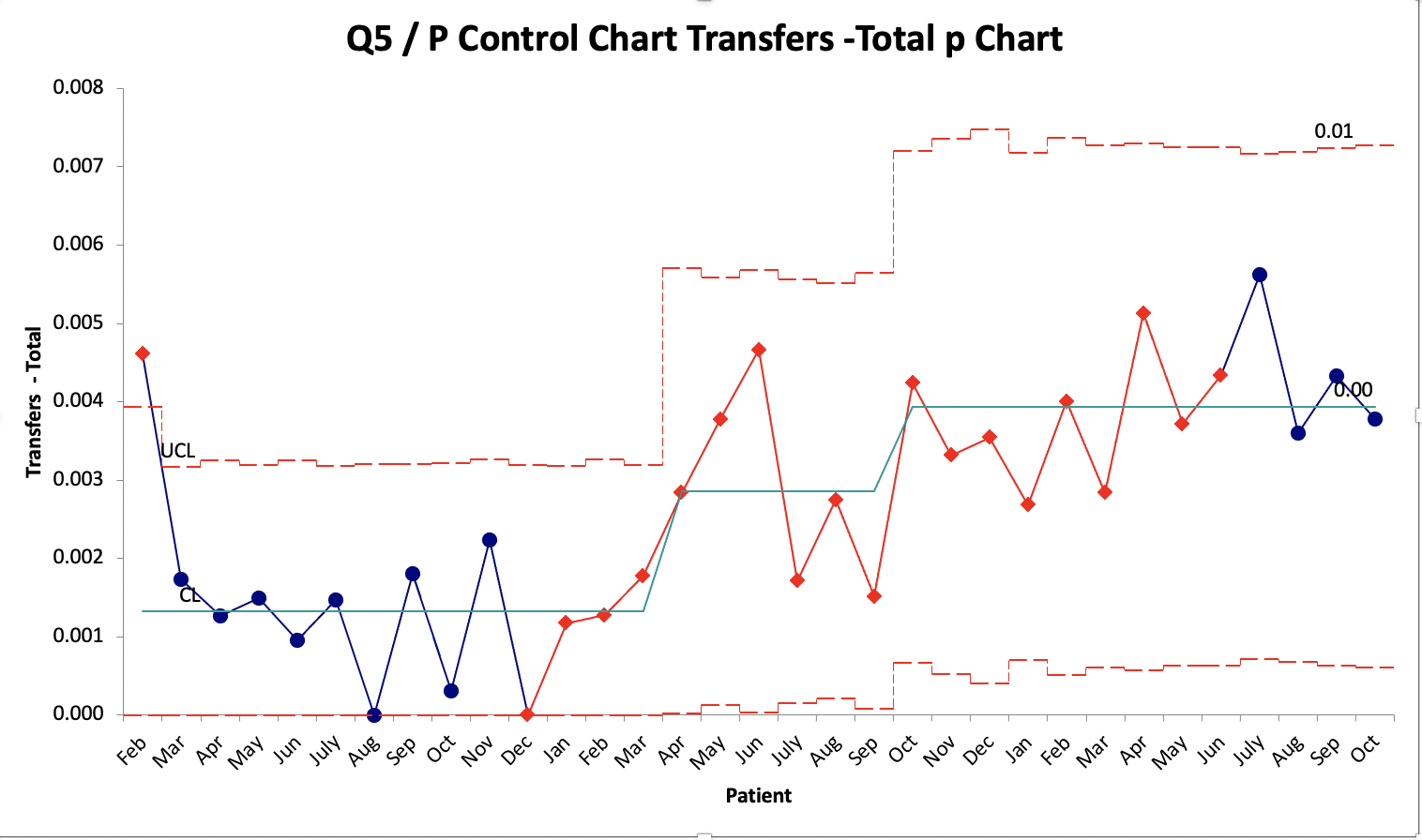
Question: Below are the two P-charts created in QI Macros (excel). Describe the difference in both charts and changes in the number of transfers? Analyze the
Below are the two P-charts created in QI Macros (excel). Describe the difference in both charts and changes in the number of transfers? Analyze the differences in the upper limit, lower limit, and mean for both charts?
Original chart:
After applying the Process change analysis tool:
Step by Step Solution
There are 3 Steps involved in it
1 Expert Approved Answer
Step: 1 Unlock

Question Has Been Solved by an Expert!
Get step-by-step solutions from verified subject matter experts
Step: 2 Unlock
Step: 3 Unlock