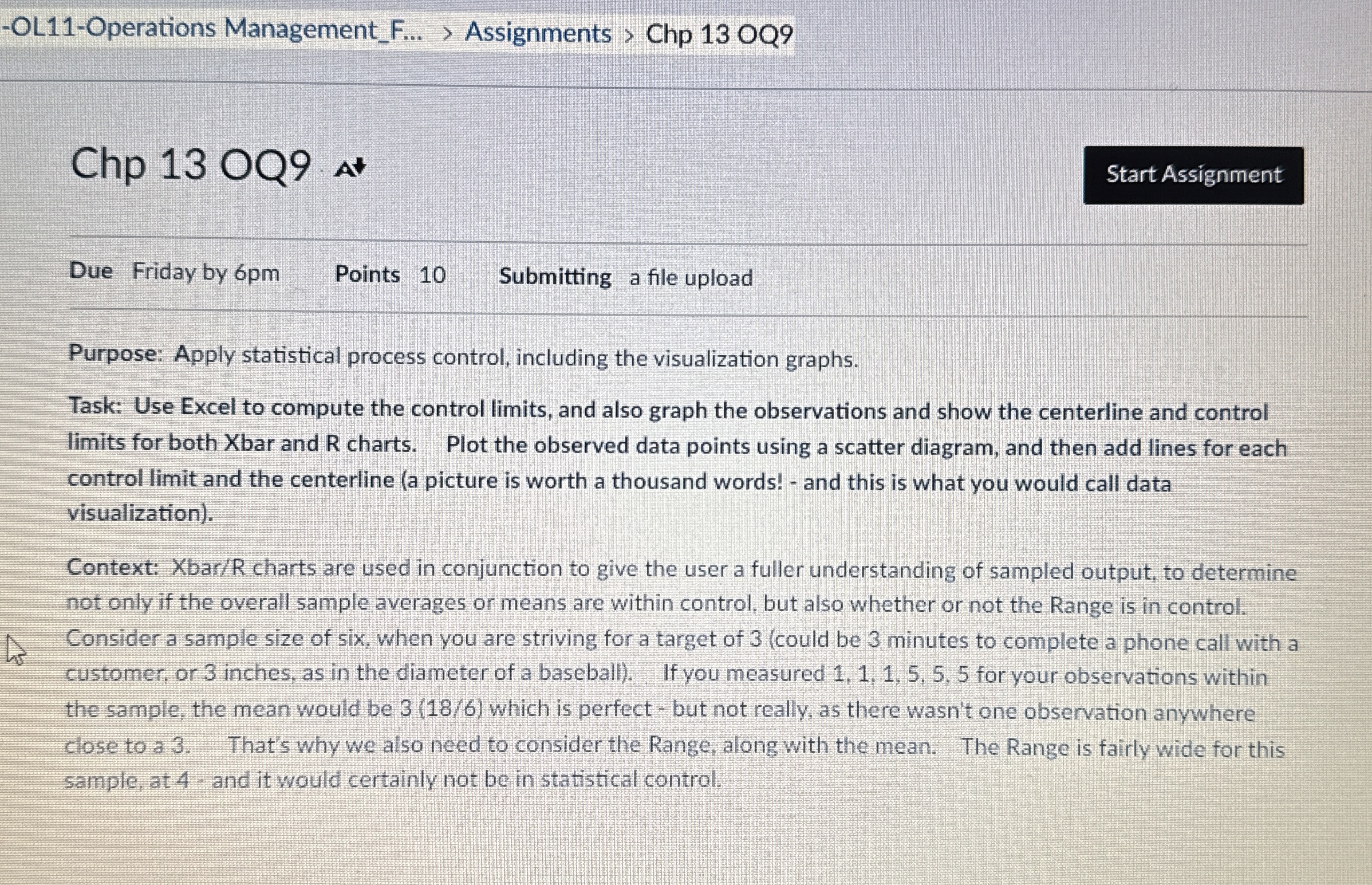
Question: Due Friday by 6 pm Points 1 0 Submitting a file upload Purpose: Apply statistical process control, including the visualization graphs. Task: Use Excel to
Due Friday by pm
Points
Submitting a file upload
Purpose: Apply statistical process control, including the visualization graphs.
Task: Use Excel to compute the control limits and also graph the observations and show the centerline and control
limits for both Xbar and R charts. Plot the observed data points using a scatter diagram, and then add lines for each
control limit and the centerline a picture is worth a thousand words! and this is what you would call data
visualization
Context: XbarR charts are used in conjunction to give the user a fuller understanding of sampled output, to determine
not only if the overall sample averages or means are within control, but also whether or not the Range is in control.
Consider a sample size of six, when you are striving for a target of could be minutes to complete a phone call with a
customer, or inches, as in the diameter of a baseball If you measured for your observations within
the sample, the mean would be which is perfect but not really, as there wasn't one observation anywhere
close to a That's why we also need to consider the Range, along with the mean. The Range is fairly wide for this
sample, at and it would certainly not be in statistical control.

Step by Step Solution
There are 3 Steps involved in it
1 Expert Approved Answer
Step: 1 Unlock


Question Has Been Solved by an Expert!
Get step-by-step solutions from verified subject matter experts
Step: 2 Unlock
Step: 3 Unlock


